What is New in SAS 9.2? Graphics and More
47 Slides1.52 MB
What is New in SAS 9.2? Graphics and More
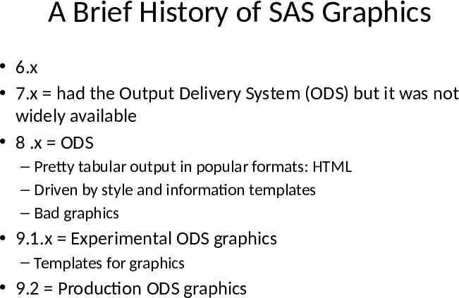
A Brief History of SAS Graphics 6.x 7.x had the Output Delivery System (ODS) but it was not widely available 8 .x ODS – Pretty tabular output in popular formats: HTML – Driven by style and information templates – Bad graphics 9.1.x Experimental ODS graphics – Templates for graphics 9.2 Production ODS graphics
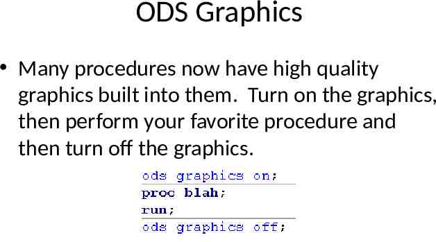
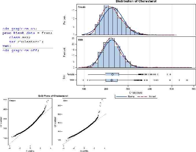
ODS Graphics Many procedures now have high quality graphics built into them. Turn on the graphics, then perform your favorite procedure and then turn off the graphics.
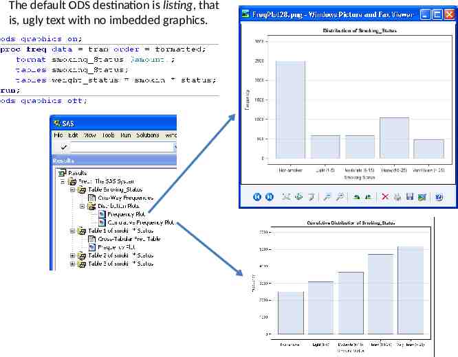
The default ODS destination is listing, that is, ugly text with no imbedded graphics.
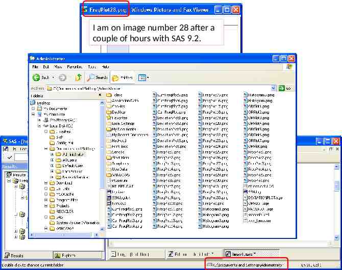
I am on image number 28 after a couple of hours with SAS 9.2.
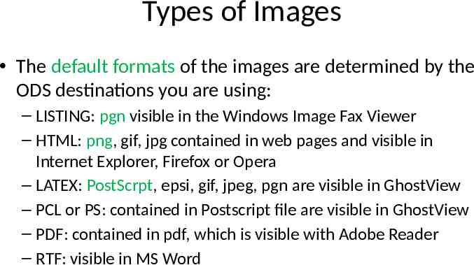
Types of Images The default formats of the images are determined by the ODS destinations you are using: – LISTING: pgn visible in the Windows Image Fax Viewer – HTML: png, gif, jpg contained in web pages and visible in Internet Explorer, Firefox or Opera – LATEX: PostScrpt, epsi, gif, jpeg, pgn are visible in GhostView – PCL or PS: contained in Postscript file are visible in GhostView – PDF: contained in pdf, which is visible with Adobe Reader – RTF: visible in MS Word
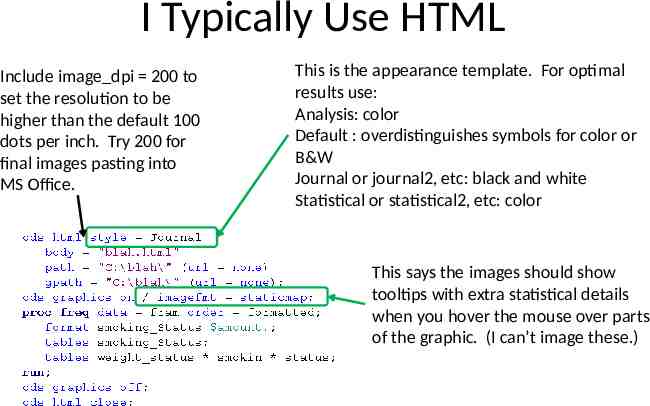
I Typically Use HTML Include image dpi 200 to set the resolution to be higher than the default 100 dots per inch. Try 200 for final images pasting into MS Office. This is the appearance template. For optimal results use: Analysis: color Default : overdistinguishes symbols for color or B&W Journal or journal2, etc: black and white Statistical or statistical2, etc: color This says the images should show tooltips with extra statistical details when you hover the mouse over parts of the graphic. (I can’t image these.)
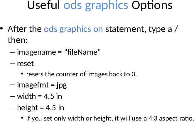
Useful ods graphics Options After the ods graphics on statement, type a / then: – imagename “fileName” – reset resets the counter of images back to 0. – imagefmt jpg – width 4.5 in – height 4.5 in If you set only width or height, it will use a 4:3 aspect ratio.
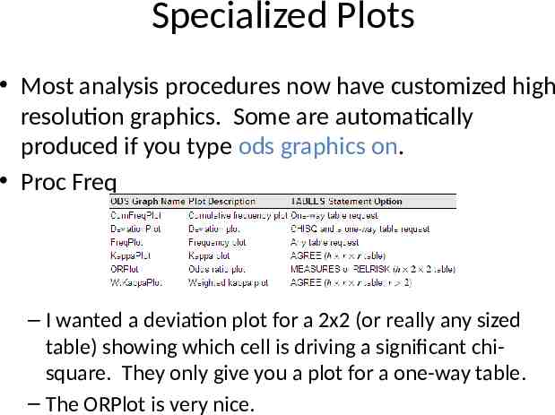
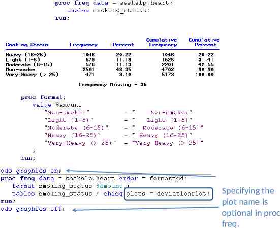
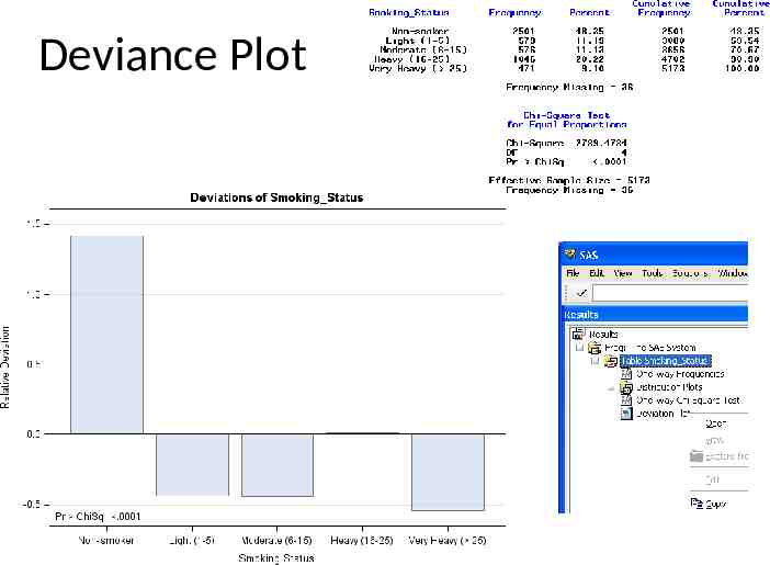
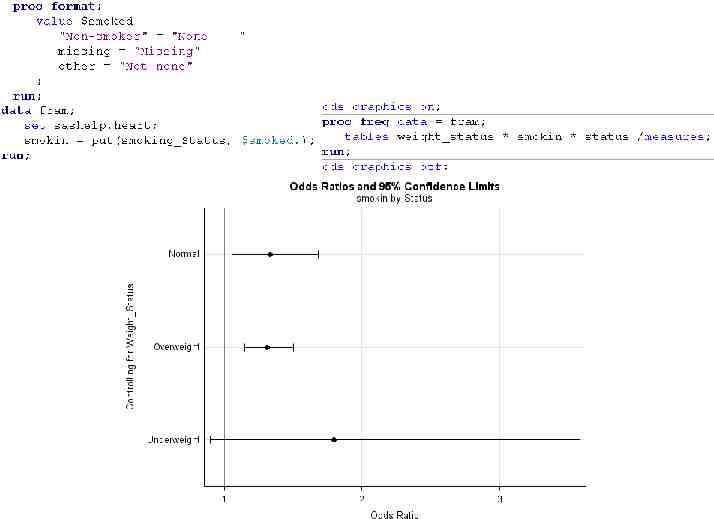
Specialized Plots Most analysis procedures now have customized high resolution graphics. Some are automatically produced if you type ods graphics on. Proc Freq – I wanted a deviation plot for a 2x2 (or really any sized table) showing which cell is driving a significant chisquare. They only give you a plot for a one-way table. – The ORPlot is very nice.
Specifying the plot name is optional in proc freq.
Deviance Plot
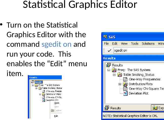
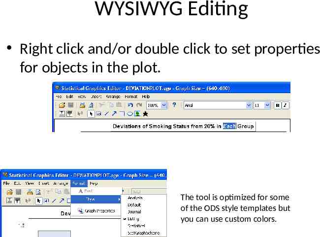
Statistical Graphics Editor Turn on the Statistical Graphics Editor with the command sgedit on and run your code. This enables the “Edit” menu item.
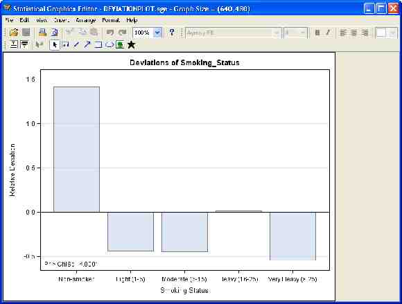
WYSIWYG Editing Right click and/or double click to set properties for objects in the plot. The tool is optimized for some of the ODS style templates but you can use custom colors.
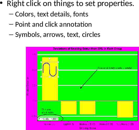
Right click on things to set properties. – Colors, text details, fonts – Point and click annotation – Symbols, arrows, text, circles
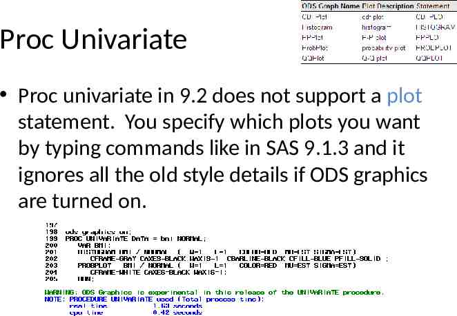
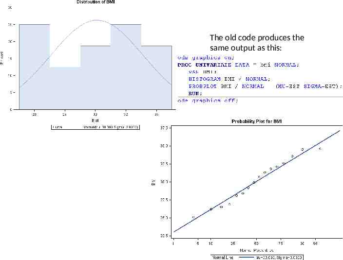
Proc Univariate Proc univariate in 9.2 does not support a plot statement. You specify which plots you want by typing commands like in SAS 9.1.3 and it ignores all the old style details if ODS graphics are turned on.
The old code produces the same output as this:
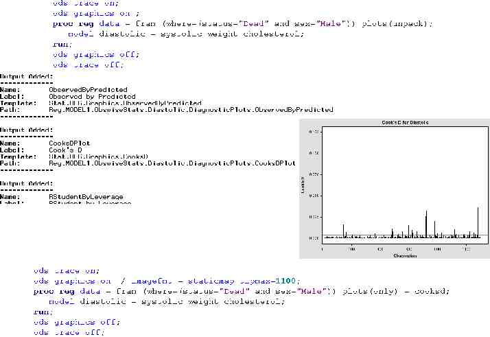
Too Many Graphics If the ods graphics on statement gives you too many graphics, you can specify which graphics you want by including code designed for the procedure. Typically it looks like this: plot(only) (table names). This design is poorly implemented because you need to know where to put the plot statement and what the table names are. Does it go on the proc line (like phreg), the tables line (like proc freq), or some other line? Also the table names specified with a plot statement do not always match the ODS table names.
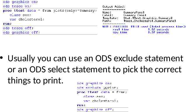
Usually you can use an ODS exclude statement or an ODS select statement to pick the correct things to print.
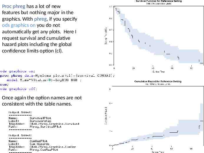
Proc phreg has a lot of new features but nothing major in the graphics. With phreg, if you specify ods graphics on you do not automatically get any plots. Here I request survival and cumulative hazard plots including the global confidence limits option (cl). Once again the option names are not consistent with the table names.
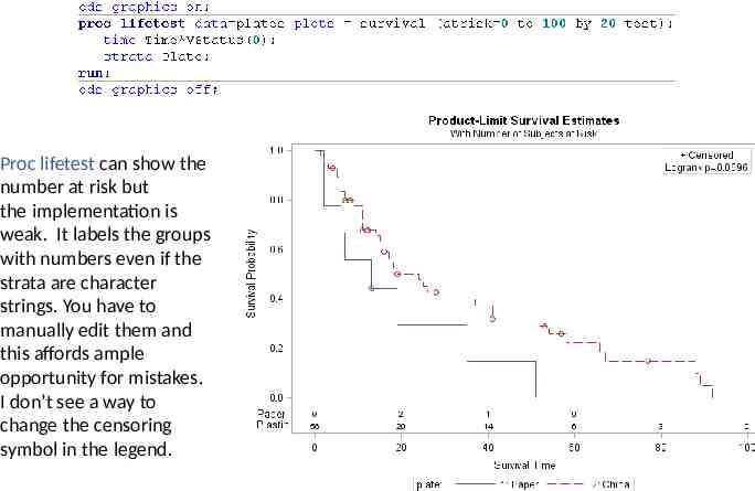
Proc lifetest can show the number at risk but the implementation is weak. It labels the groups with numbers even if the strata are character strings. You have to manually edit them and this affords ample opportunity for mistakes. I don’t see a way to change the censoring symbol in the legend.
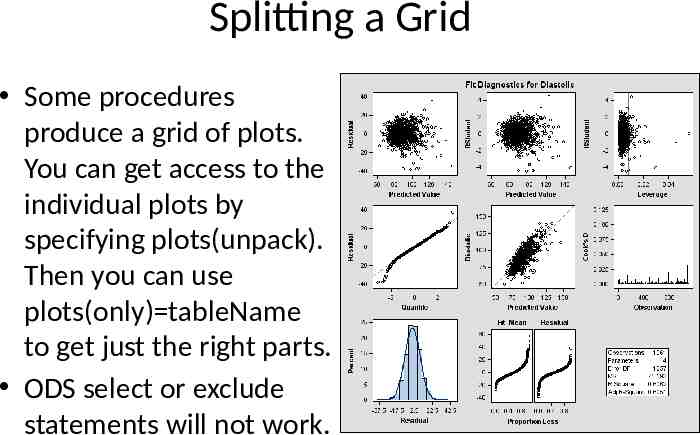
Splitting a Grid Some procedures produce a grid of plots. You can get access to the individual plots by specifying plots(unpack). Then you can use plots(only) tableName to get just the right parts. ODS select or exclude statements will not work.
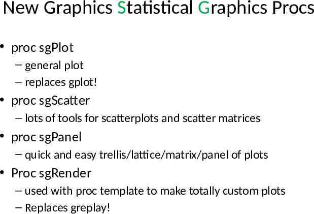
New Graphics Statistical Graphics Procs proc sgPlot – general plot – replaces gplot! proc sgScatter – lots of tools for scatterplots and scatter matrices proc sgPanel – quick and easy trellis/lattice/matrix/panel of plots Proc sgRender – used with proc template to make totally custom plots – Replaces greplay!
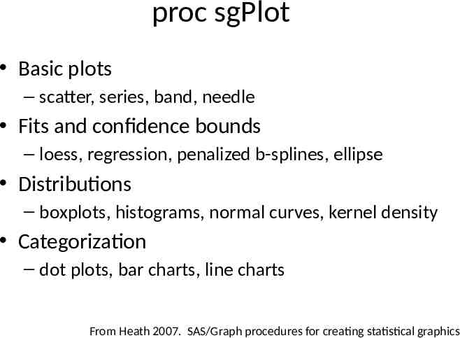
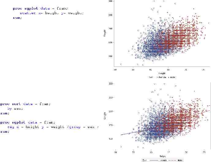
proc sgPlot Basic plots – scatter, series, band, needle Fits and confidence bounds – loess, regression, penalized b-splines, ellipse Distributions – boxplots, histograms, normal curves, kernel density Categorization – dot plots, bar charts, line charts From Heath 2007. SAS/Graph procedures for creating statistical graphics
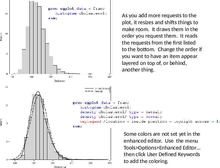
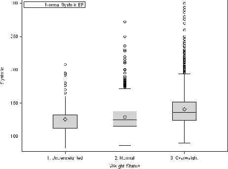
As you add more requests to the plot, it resizes and shifts things to make room. It draws them in the order you request them. It reads the requests from the first listed to the bottom. Change the order if you want to have an item appear layered on top of, or behind, another thing. Some colors are not set yet in the enhanced editor. Use the menu Tools Options Enhanced Editor then click User Defined Keywords to add the coloring.
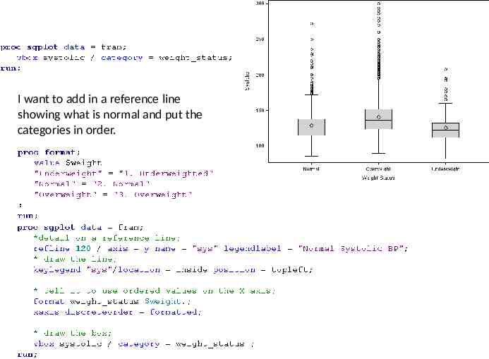
I want to add in a reference line showing what is normal and put the categories in order.
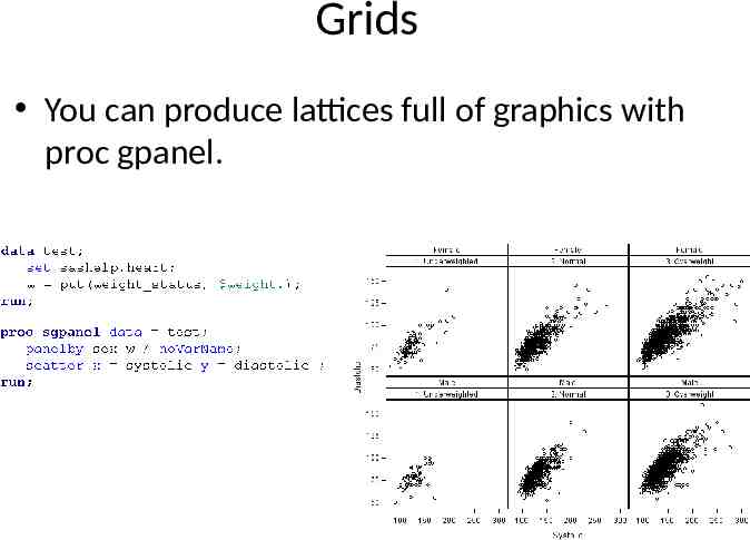
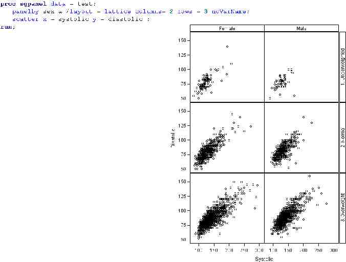
Grids You can produce lattices full of graphics with proc gpanel.
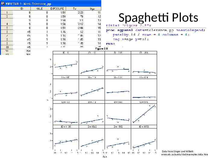
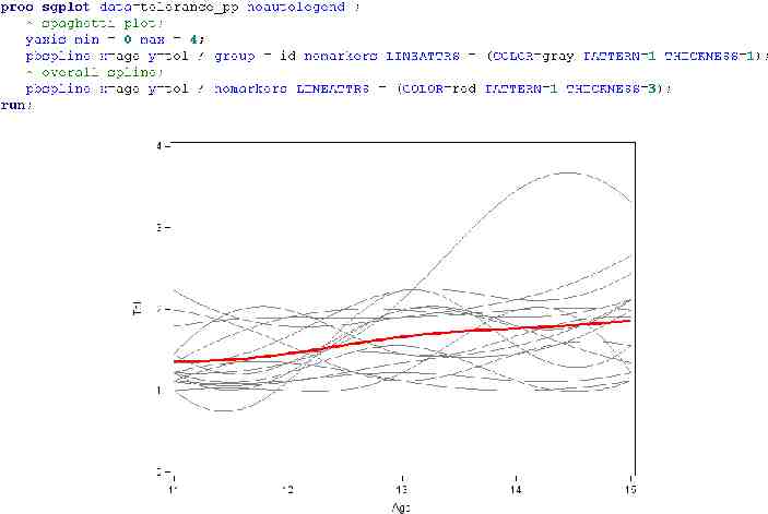
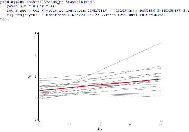
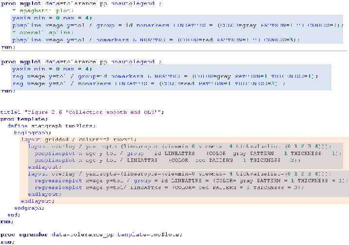
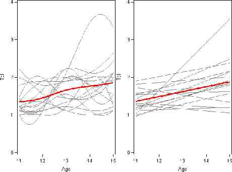
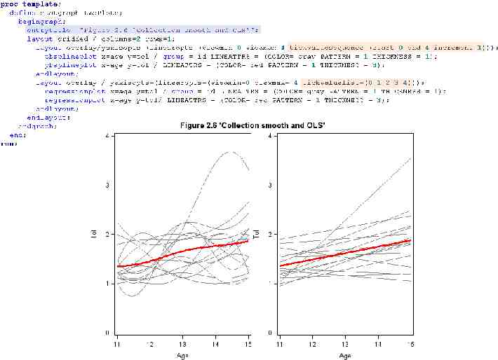
Spaghetti Plots Data from Singer and Willett: www.ats.ucla.edu/stat/examples/alda.htm
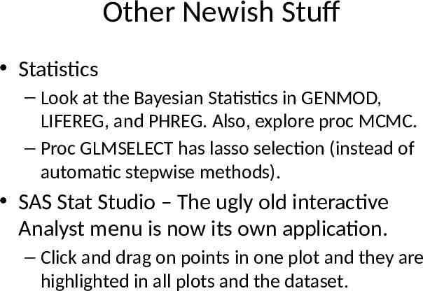
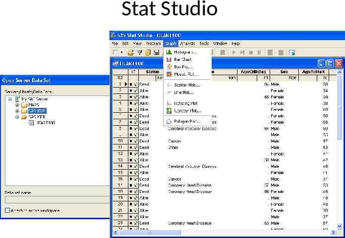
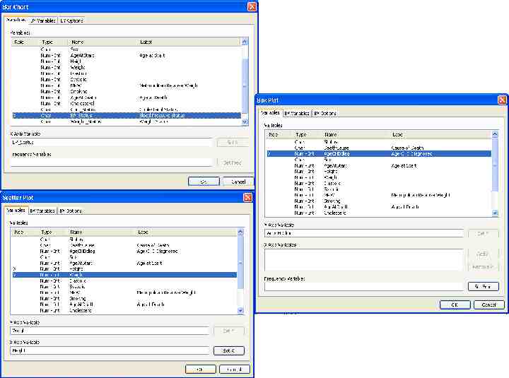
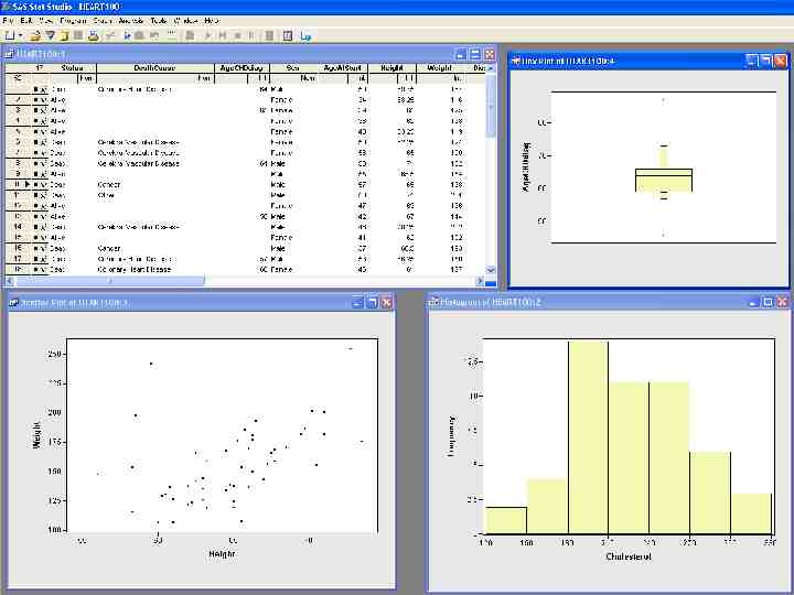
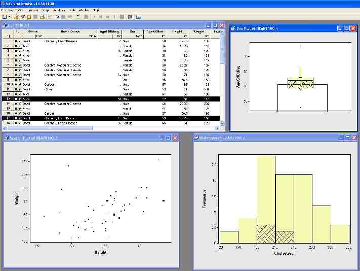
Other Newish Stuff Statistics – Look at the Bayesian Statistics in GENMOD, LIFEREG, and PHREG. Also, explore proc MCMC. – Proc GLMSELECT has lasso selection (instead of automatic stepwise methods). SAS Stat Studio – The ugly old interactive Analyst menu is now its own application. – Click and drag on points in one plot and they are highlighted in all plots and the dataset.
Stat Studio
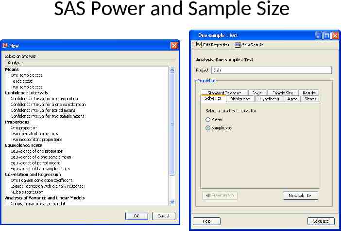
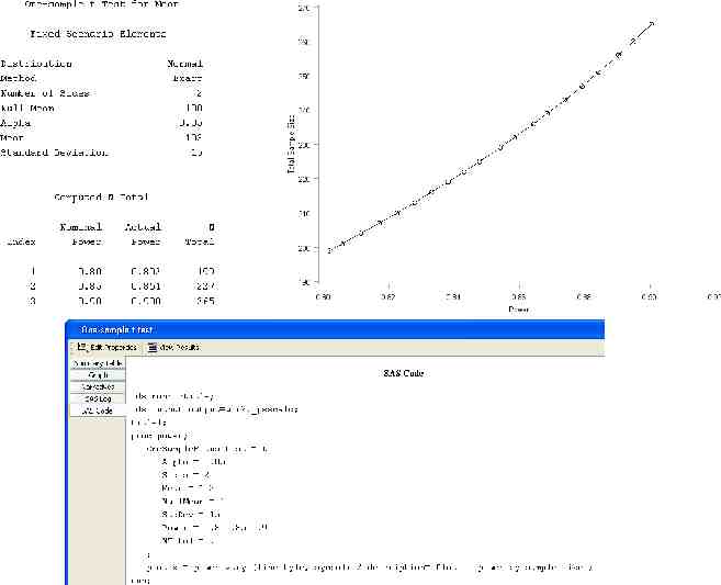
SAS Power and Sample Size
Learn More as Needed SAS/STAT 9.2 User's Guide Introductory and Common Chapters SAS/STAT 9.2 support.sas.com/documentation/onlinedoc/stat/index chapter.html – Using the Output Delivery System – Statistical Graphics Using ODS I have all the conference presentations on ODS graphics.

