User Interface Design ECE 417/617: Elements of Software Engineering
26 Slides2.97 MB
User Interface Design ECE 417/617: Elements of Software Engineering Stan Birchfield Clemson University
References Joel Spolsky, User Interface Design for Programmers abridged version available at http://www.joelonsoftware.com
Why study user interfaces? Good UIs are critical to success UI programming is – easy (sophisticated algorithms not required) – straightforward (can immediately correct mistakes) – fun (results are immediately visible) – rational (apply simple rules) UI design is not graphic design
Cardinal axiom “A user interface is well-designed when the program behaves exactly how the user thought it would.” – Joel Spolsky – user is happy user in control S/W correctly interprets user’s actions – loss of control depression, frustration (“Learned Helplessness” [Seligman]) All the other rules are just corollaries: – Golden rules: place user in control, reduce user’s memory load, make interface consistent
User and program models User model: User’s idea of what’s happening Program model: Program’s idea of what’s happening (i.e., what’s actually happening) Successful UI when program model corresponds to user model – Speak user’s language – Follow real-world conventions, make information appear in natural and logical order – Use metaphors from real world
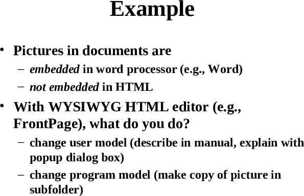
Example Pictures in documents are – embedded in word processor (e.g., Word) – not embedded in HTML With WYSIWYG HTML editor (e.g., FrontPage), what do you do? – change user model (describe in manual, explain with popup dialog box) – change program model (make copy of picture in subfolder)
How do you get the user model? Ask the users! The 50-cent usability test – Usually 5-6 people is enough, will start to see consensus – Don’t need formal usability lab, or “people off the street” – Just sketch or prototype and ask your neighbor
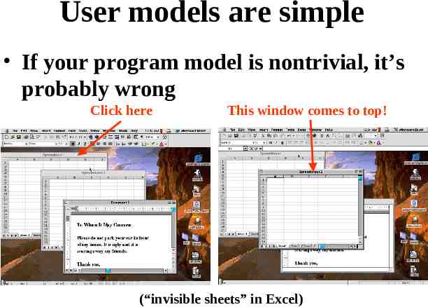
User models are simple If your program model is nontrivial, it’s probably wrong Click here This window comes to top! (“invisible sheets” in Excel)
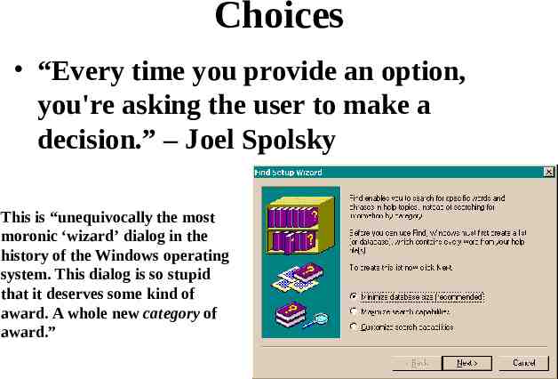
Choices “Every time you provide an option, you're asking the user to make a decision.” – Joel Spolsky This is “unequivocally the most moronic ‘wizard’ dialog in the history of the Windows operating system. This dialog is so stupid that it deserves some kind of award. A whole new category of award.”
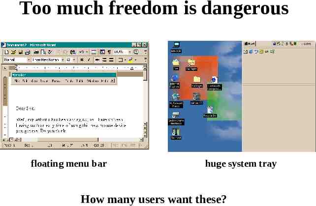
Too much freedom is dangerous floating menu bar huge system tray How many users want these?
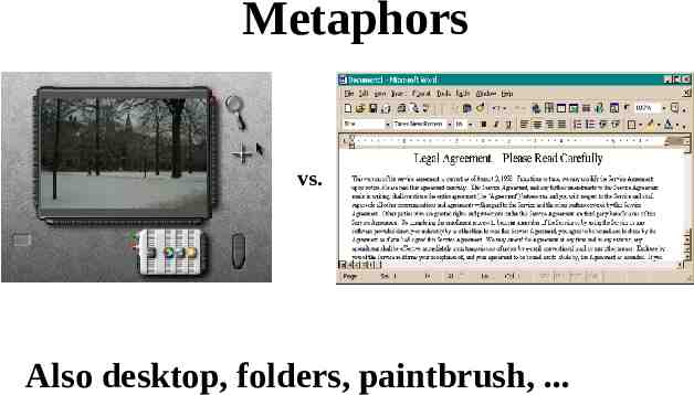
Metaphors vs. Also desktop, folders, paintbrush, .
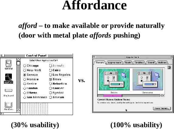
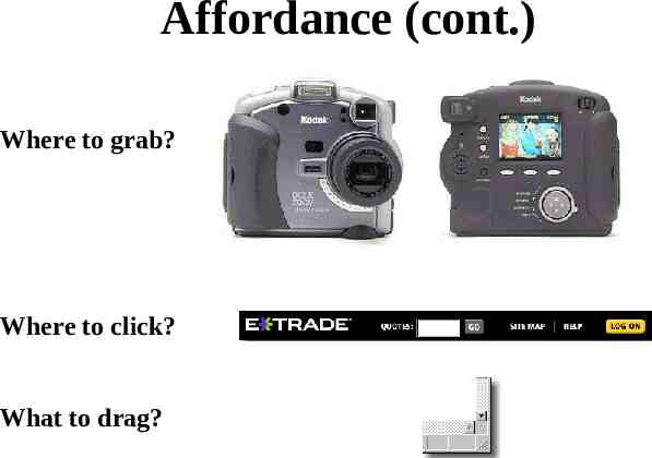
Affordance afford – to make available or provide naturally (door with metal plate affords pushing) vs. (30% usability) (100% usability)
Affordance (cont.) Where to grab? Where to click? What to drag?
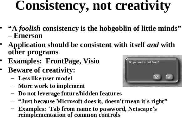
Consistency, not creativity “A foolish consistency is the hobgoblin of little minds” – Emerson Application should be consistent with itself and with other programs Examples: FrontPage, Visio Beware of creativity: – – – – – Less like user model More work to implement Do not leverage future/hidden features “Just because Microsoft does it, doesn't mean it's right” Examples: Tab from name to password, Netscape’s reimplementation of common controls
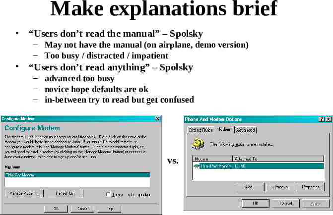
Make explanations brief “Users don’t read the manual” – Spolsky – May not have the manual (on airplane, demo version) – Too busy / distracted / impatient “Users don’t read anything” – Spolsky – advanced too busy – novice hope defaults are ok – in-between try to read but get confused vs.
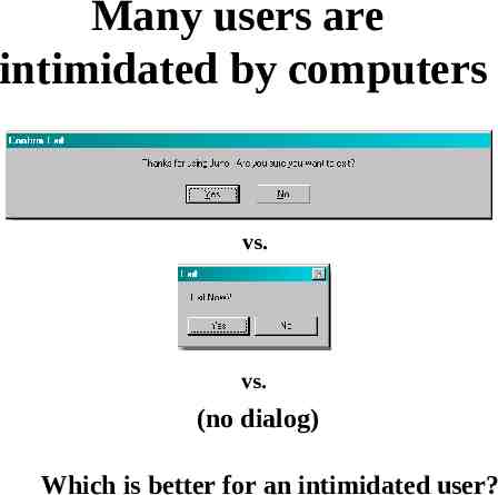
Many users are intimidated by computers vs. vs. (no dialog) Which is better for an intimidated user?
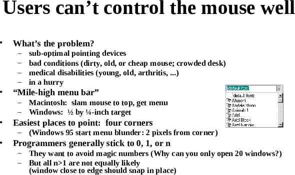
Users can’t control the mouse well What’s the problem? – – – – sub-optimal pointing devices bad conditions (dirty, old, or cheap mouse; crowded desk) medical disabilities (young, old, arthritis, .) in a hurry “Mile-high menu bar” – Macintosh: slam mouse to top, get menu – Windows: ½ by ¼-inch target Easiest places to point: four corners – (Windows 95 start menu blunder: 2 pixels from corner) Programmers generally stick to 0, 1, or n – They want to avoid magic numbers (Why can you only open 20 windows?) – But all n 1 are not equally likely (window close to edge should snap in place)
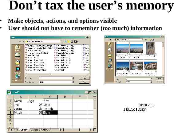
Don’t tax the user’s memory Make objects, actions, and options visible User should not have to remember (too much) information
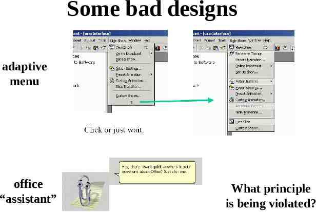
Some bad designs adaptive menu office “assistant” What principle is being violated?
The bell curve Users lie on a bell curve – – – – 98% can use a TV 70% can use Windows 15% can use Linux 1% can program Users are not dolts But, the easier you make the program, the more people can use it (10% more usable 50% more users)
Activity-based UI Two ways of designing UI: – What features should be there? Greeting card example: add text, add picture, get predesigned card from library, send by email, print – What activities will users do? Greeting card example: birthday greeting, party invitation, anniversary greeting (leads to unexpected features: remind to send next year) Example: – Excel was designed for financial number-crunching, but many use it for lists – Improv was to be “killer app” for NeXT great for complicated multi-dimensional financial models painful for lists
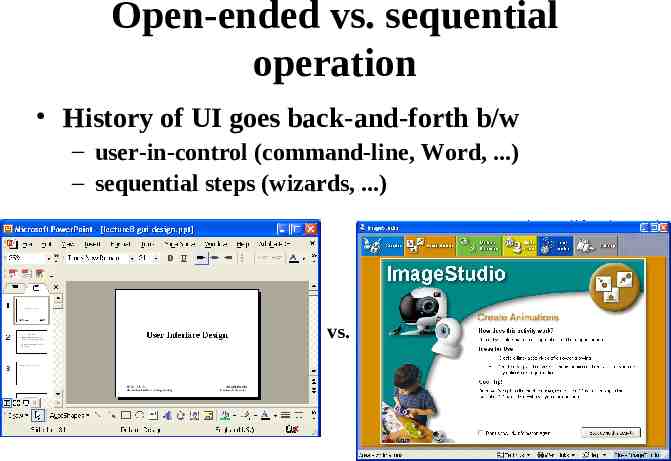
Open-ended vs. sequential operation History of UI goes back-and-forth b/w – user-in-control (command-line, Word, .) – sequential steps (wizards, .) vs.
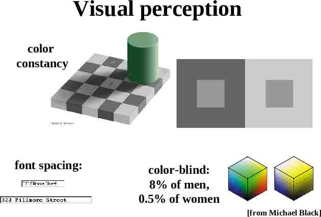
Visual perception color constancy font spacing: color-blind: 8% of men, 0.5% of women [from Michael Black]
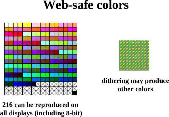
Web-safe colors dithering may produce other colors 216 can be reproduced on all displays (including 8-bit)
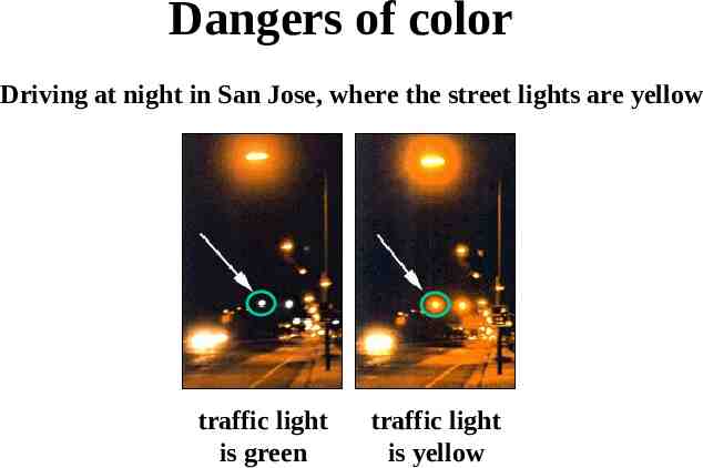
Dangers of color Driving at night in San Jose, where the street lights are yellow traffic light is green traffic light is yellow
Beyond WIMP WIMP (windows, icons, menus, pointers) WYSIWYG is WYSIAYG Importance of language – grouping, conditionals, referring to objects not immediately visible or future – support novice and power-user – provide concrete and abstract ways of manipulation – keyboard shortcuts / macros Shared control – Delegation of routine or complex tasks to computer
