PowerPoint Guidelines P R E – S E T T E M P L AT E S & U S A G E T I
13 Slides863.43 KB
PowerPoint Guidelines P R E - S E T T E M P L AT E S & U S A G E T I P S Stanford University Communications Version 6, issued 5/14/14
Contents Layout options Title slides Slide layouts – options Background options Slide layouts – which to use Design Elements Fonts Slide Transitions Color Palettes Graph & Chart Examples
Stanford University Template for Microsoft Office PowerPoint CHOOSING THE RIGHT PA G E L AY O U T Drag Drag picture picture to to placeholder or placeholder or click click icon icon to to add add
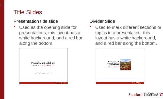
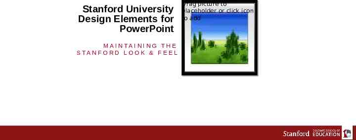
4 Title Slides Presentation title slide Used as the opening slide for presentations, this layout has a white background, and a red bar along the bottom. Divider Slide Used to mark different sections or topics in a presentation, this layout has a white background, and a red bar along the bottom.
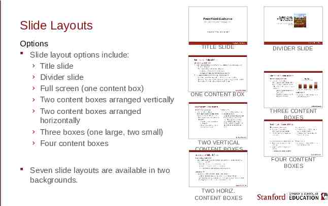
Slide Layouts Options Slide layout options include: › Title slide › Divider slide › Full screen (one content box) › Two content boxes arranged vertically › Two content boxes arranged horizontally › Three boxes (one large, two small) › Four content boxes TITLE SLIDE DIVIDER SLIDE ONE CONTENT BOX THREE CONTENT BOXES TWO VERTICAL CONTENT BOXES FOUR CONTENT BOXES Seven slide layouts are available in two backgrounds. TWO HORIZ. CONTENT BOXES
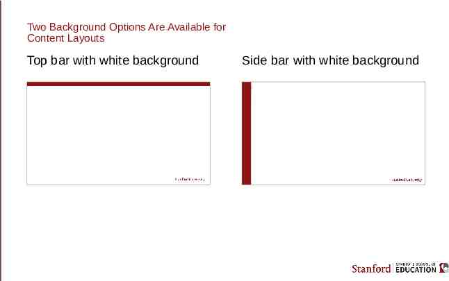
Two Background Options Are Available for Content Layouts Top bar with white background Side bar with white background
Slide Layouts Which to use? The page numbering and title on every layout is in the same place, whether the red bar is across the top or along the left side. While it is preferable to have all slides in a presentation use either the top bar layouts or the side bar layouts, it is possible to mix them. The content boxes can contain text, tables, charts and graphs, SmartArt graphics, or images When inserting content from other PowerPoint files, remember to apply a slide layout and check that all content is using the master boxes
Stanford University Design Elements for PowerPoint M A I N TA I N I N G T H E S TA N F O R D L O O K & F E E L Drag Drag picture picture to to placeholder or placeholder or click click icon icon to to add add
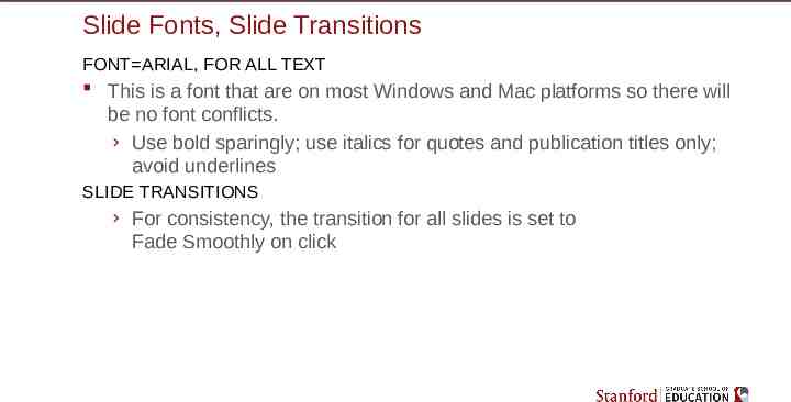
Slide Fonts, Slide Transitions FONT ARIAL, FOR ALL TEXT This is a font that are on most Windows and Mac platforms so there will be no font conflicts. › Use bold sparingly; use italics for quotes and publication titles only; avoid underlines SLIDE TRANSITIONS › For consistency, the transition for all slides is set to Fade Smoothly on click
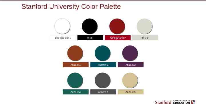
Stanford University Color Palette Background 1 Text 1 Background 2 Accent 1 Accent 2 Accent 3 Accent 4 Accent 5 Accent 6 Text 2
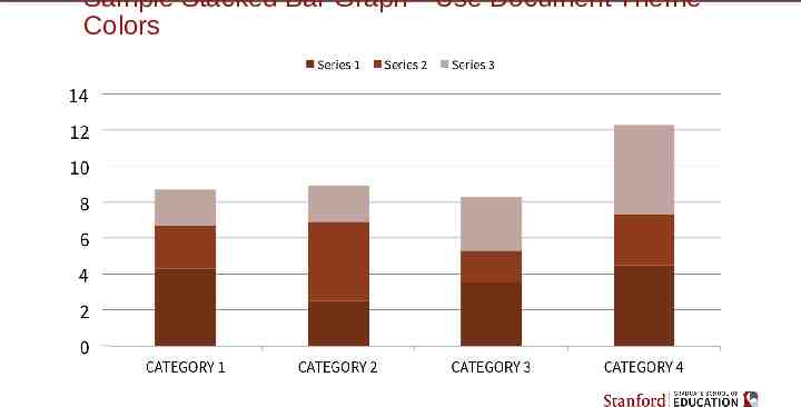
Sample Stacked Bar Graph—Use Document Theme Colors
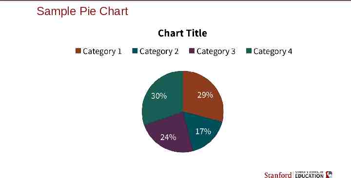
Sample Pie Chart
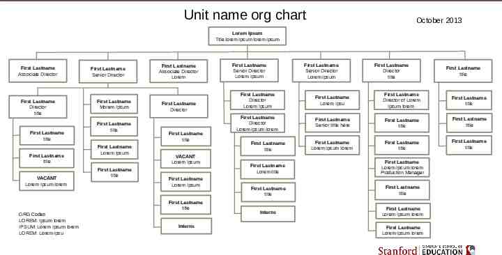
Unit name org chart October 2013 Lorem Ipsum Title lorem Ipsum lorem ipsum First Lastname Associate Director First Lastname Director title First Lastname title First Lastname title VACANT Lorem Ipsum lorem First Lastname Senior Director First Lastname Morem Ipsum First Lastname title First Lastname Lorem Ipsum First Lastname title First Lastname Associate Director Lorem First Lastname Director First Lastname title VACANT Lorem Ipsum First Lastname Lorem Ipsum First Lastname title ORG Codes LOREM: Ipsum lorem IPSUM: Lorem Ipsum lorem LOREM: Lorem Ipsu Interns First Lastname Senior Director Lorem Ipsum First Lastname Senior Director Lorem Ipsum First Lastname Director title First Lastname title First Lastname Director Lorem Ipsum First Lastname Lorem Ipsu First Lastname Director of Lorem Ipsum lorem First Lastname title First Lastname Director Lorem Ipsum lorem First Lastname Senior tiltle here First Lastname title First Lastname title First Lastname Lorem Ipsum lorem First Lastname title First Lastname title First Lastname title First Lastname Lorem title First Lastname Lorem Ipsum lorem Production Manager First Lastname title First Lastname title Interns First Lastname Lorem Ipsum lorem First Lastname Lorem Ipsum lorem
