MIS2502: Data Analytics Principles of Data Visualization
47 Slides7.13 MB
MIS2502: Data Analytics Principles of Data Visualization Acknowledgement: David Schuff Aaron Zhi Cheng http://community.mis.temple.edu/zcheng/ [email protected]
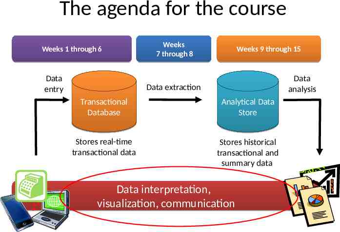
The agenda for the course Weeks 1 through 6 Data entry Weeks 7 through 8 Weeks 9 through 15 Data analysis Data extraction Transactional Database Analytical Data Store Stores real-time transactional data Stores historical transactional and summary data Data interpretation, visualization, communication
Why Data Visualization? Because of the way the human brain processes information, using charts or graphs to visualize large amounts of complex data is easier than poring over spreadsheets or reports. https://www.sas.com/en us/insights/big-data/data-visualization.html#
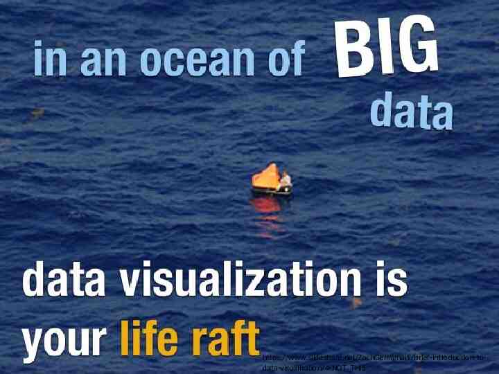
https://www.slideshare.net/ZachGemignani/brief-introduction-todata-visualization/4-NOT THIS
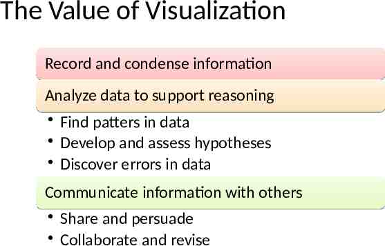
The Value of Visualization Record and condense information Analyze data to support reasoning Find patters in data Develop and assess hypotheses Discover errors in data Communicate information with others Share and persuade Collaborate and revise
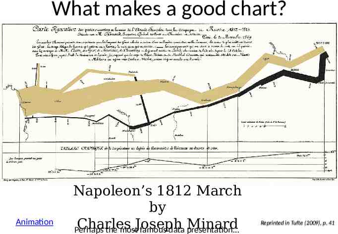
What makes a good chart? Animation Napoleon’s 1812 March by Charles Minard Perhaps the mostJoseph famous data presentation Reprinted in Tufte (2009), p. 41
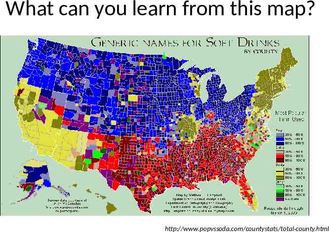
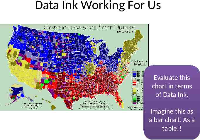
What can you learn from this map? http://www.popvssoda.com/countystats/total-county.html
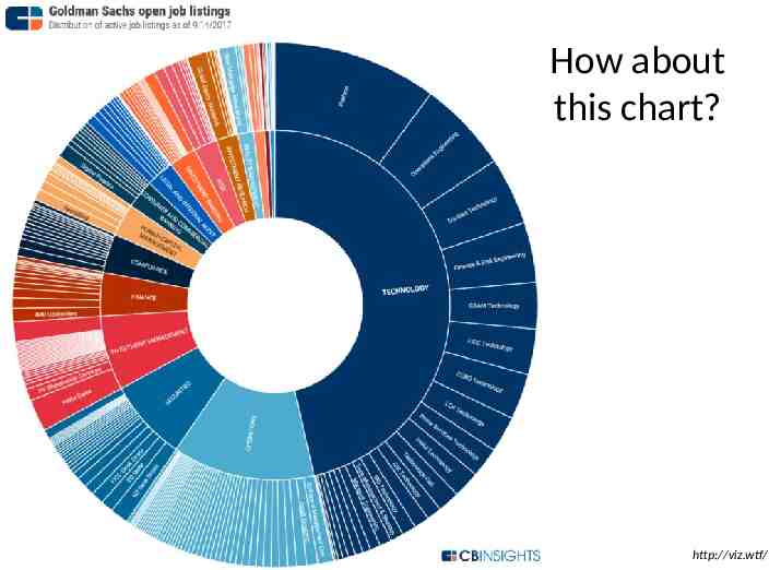
How about this chart? http://viz.wtf/
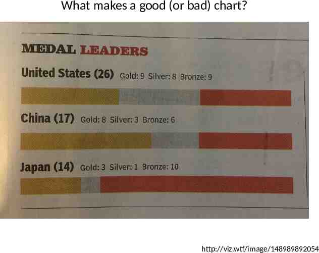
What makes a good (or bad) chart? http://viz.wtf/image/148989892054
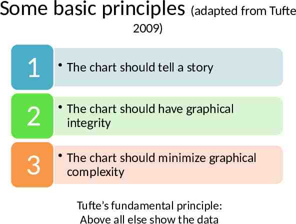
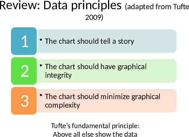
Some basic principles (adapted from Tufte 2009) 1 The chart should tell a story 2 The chart should have graphical integrity 3 The chart should minimize graphical complexity Tufte’s fundamental principle: Above all else show the data
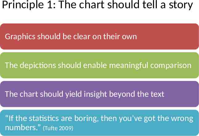
Principle 1: The chart should tell a story Graphics should be clear on their own The depictions should enable meaningful comparison The chart should yield insight beyond the text “If the statistics are boring, then you’ve got the wrong numbers.” (Tufte 2009)
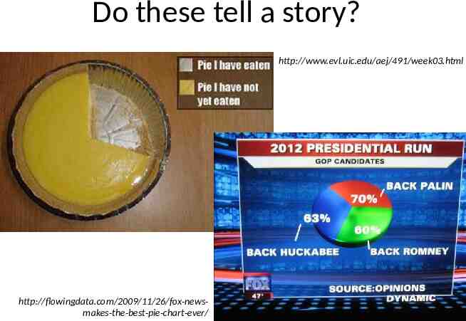
Do these tell a story? http://www.evl.uic.edu/aej/491/week03.html http://flowingdata.com/2009/11/26/fox-newsmakes-the-best-pie-chart-ever/
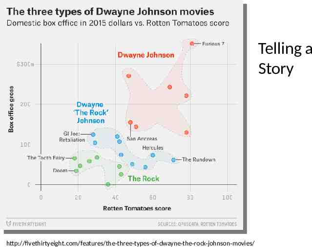
Telling a Story http://fivethirtyeight.com/features/the-three-types-of-dwayne-the-rock-johnson-movies/
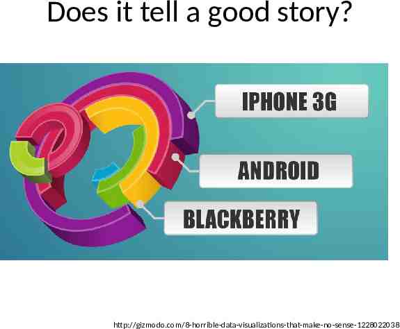
Does it tell a good story? http://gizmodo.com/8-horrible-data-visualizations-that-make-no-sense-1228022038
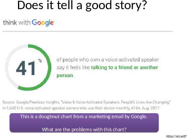
Does it tell a good story? This is a doughnut chart from a marketing email by Google. What are the problems with this chart? http://viz.wtf/
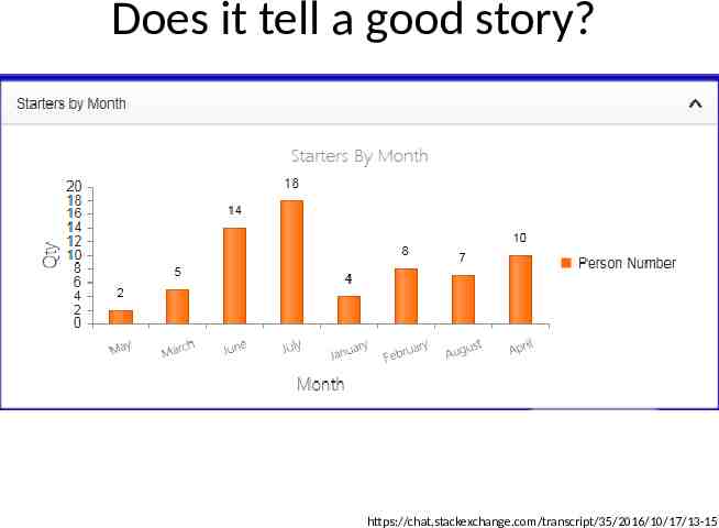
Does it tell a good story? https://chat.stackexchange.com/transcript/35/2016/10/17/13-15
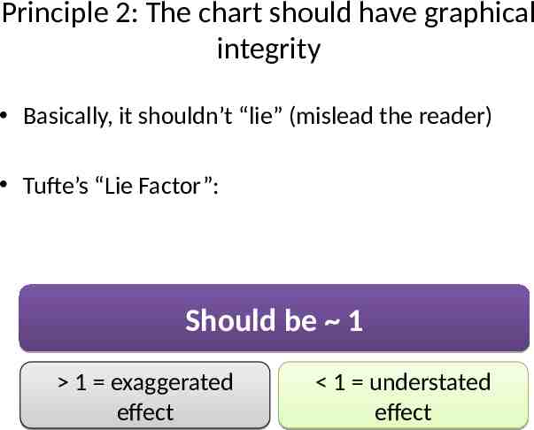
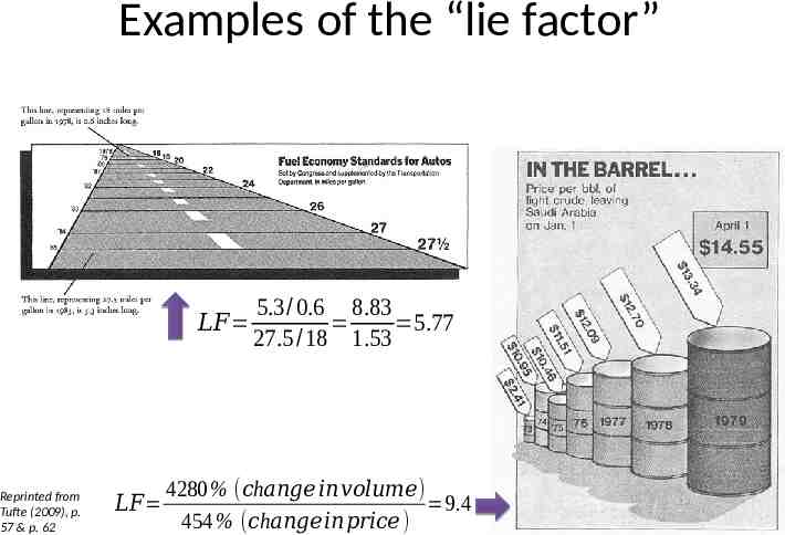
Principle 2: The chart should have graphical integrity Basically, it shouldn’t “lie” (mislead the reader) Tufte’s “Lie Factor”: Should be 1 1 exaggerated effect 1 understated effect
Examples of the “lie factor” 𝐿𝐹 Reprinted from Tufte (2009), p. 57 & p. 62 𝐿𝐹 5.3/ 0.6 8.83 5.77 27.5 /18 1.53 4280 % ( 𝑐h𝑎𝑛𝑔𝑒 𝑖𝑛𝑣𝑜𝑙𝑢𝑚𝑒) 9.4 454 % ( 𝑐h𝑎𝑛𝑔𝑒𝑖𝑛𝑝𝑟𝑖𝑐𝑒 )
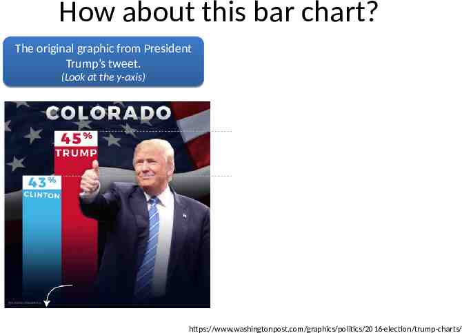
How about this bar chart? The original graphic from President Trump’s tweet. (Look at the y-axis) https://www.washingtonpost.com/graphics/politics/2016-election/trump-charts/
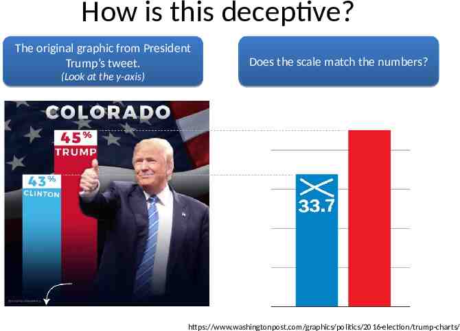
How is this deceptive? The original graphic from President Trump’s tweet. Does the scale match the numbers? (Look at the y-axis) https://www.washingtonpost.com/graphics/politics/2016-election/trump-charts/
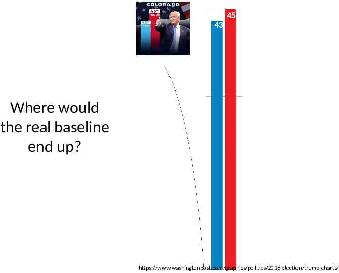
45 43 Where would the real baseline end up? https://www.washingtonpost.com/graphics/politics/2016-election/trump-charts/
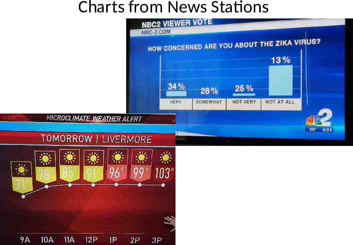
Charts from News Stations
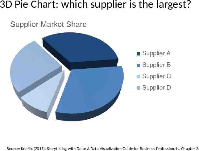
3D Pie Chart: which supplier is the largest? Source: Knaflic (2015). Storytelling with Data: A Data Visualization Guide for Business Professionals. Chapter 2.
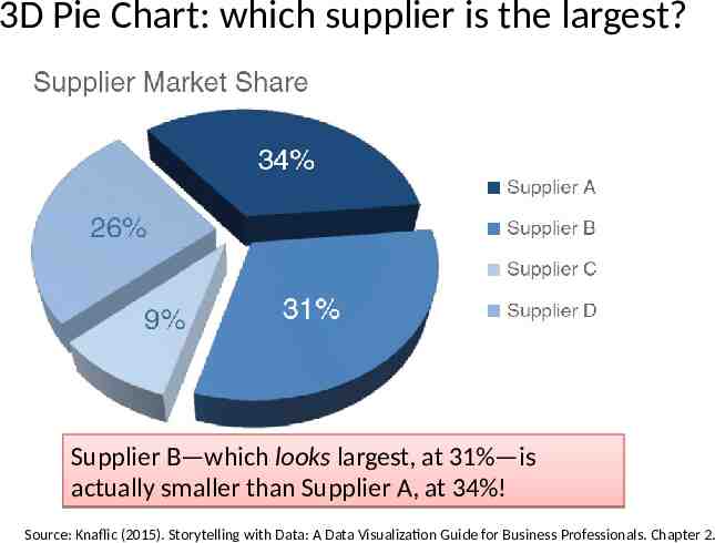
3D Pie Chart: which supplier is the largest? Supplier B—which looks largest, at 31%—is actually smaller than Supplier A, at 34%! Source: Knaflic (2015). Storytelling with Data: A Data Visualization Guide for Business Professionals. Chapter 2.
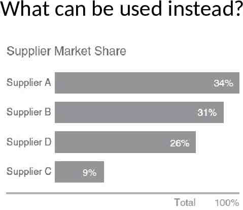
What can be used instead?
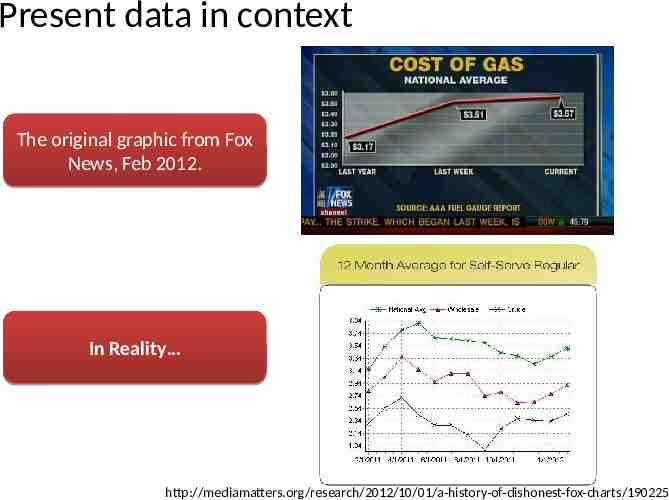
Present data in context The original graphic from Fox News, Feb 2012. In Reality http://mediamatters.org/research/2012/10/01/a-history-of-dishonest-fox-charts/190225
Principle 3: The chart should minimize graphical complexity Generally, the simpler the better Key concepts Sometimes a table is better Data-ink Chartjunk
“You know you’ve achieved perfection, not when you have nothing more to add, but when you have nothing to take away.” -- by Antoine de Saint-Exupéry
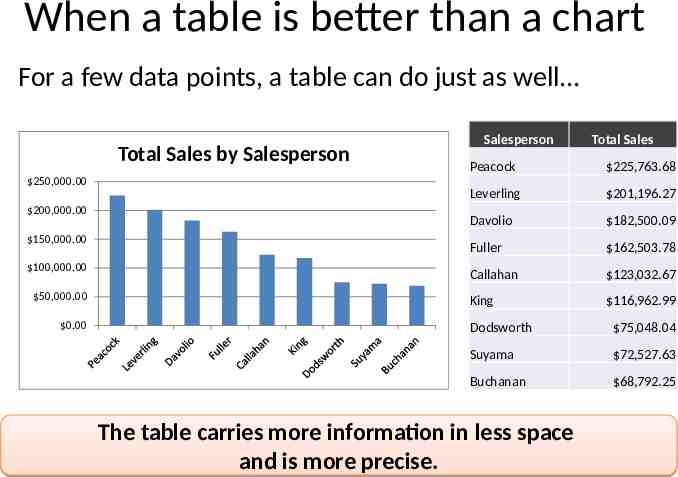
When a table is better than a chart For a few data points, a table can do just as well Total Sales by Salesperson 250,000.00 200,000.00 150,000.00 100,000.00 50,000.00 0.00 Salesperson Total Sales Peacock 225,763.68 Leverling 201,196.27 Davolio 182,500.09 Fuller 162,503.78 Callahan 123,032.67 King 116,962.99 Dodsworth 75,048.04 Suyama 72,527.63 Buchanan 68,792.25 The table carries more information in less space and is more precise.
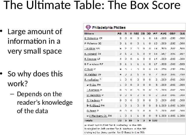
The Ultimate Table: The Box Score Large amount of information in a very small space So why does this work? – Depends on the reader’s knowledge of the data
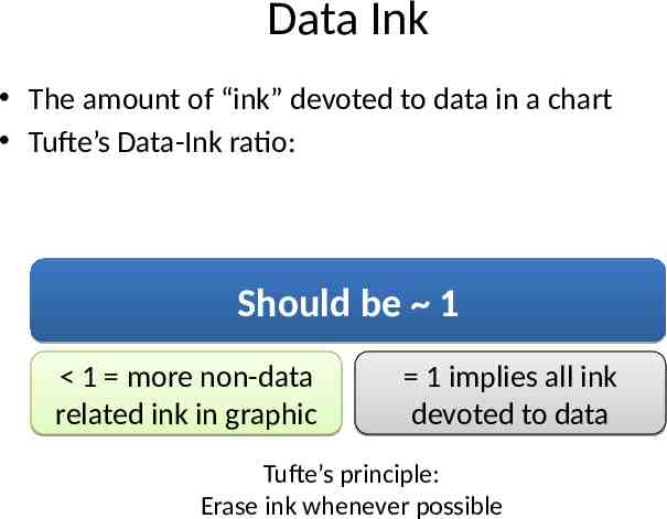
Data Ink The amount of “ink” devoted to data in a chart Tufte’s Data-Ink ratio: Should be 1 1 more non-data related ink in graphic 1 implies all ink devoted to data Tufte’s principle: Erase ink whenever possible
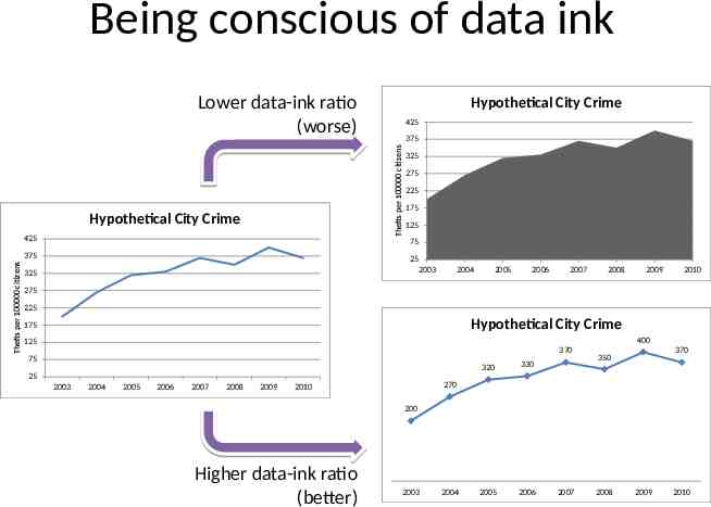
Being conscious of data ink Lower data-ink ratio (worse) 425 375 Thefts per 100000 citizens Hypothetical City Crime 425 325 275 225 175 125 75 375 Thefts per 100000 citizens Hypothetical City Crime 25 2003 325 2004 2005 2006 2007 2008 2009 2010 275 225 Hypothetical City Crime 175 400 125 370 75 25 2003 2004 2005 2006 2007 2008 2009 320 330 2005 2006 370 350 270 2010 200 Higher data-ink ratio (better) 2003 2004 2007 2008 2009 2010
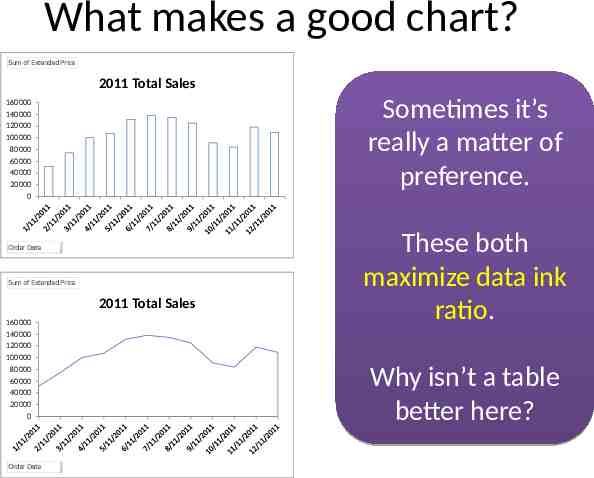
What makes a good chart? Sum of Extended Price 2011 Total Sales Sometimes it’s really a matter of preference. 160000 140000 120000 100000 80000 60000 40000 20000 0 Order Date Sum of Extended Price 2011 Total Sales 160000 140000 120000 100000 80000 60000 40000 20000 0 Order Date These both maximize data ink ratio. Why isn’t a table better here?
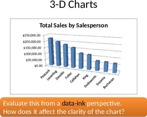
3-D Charts Total Sales by Salesperson 250,000.00 200,000.00 150,000.00 100,000.00 50,000.00 0.00 Evaluate this from a data-ink perspective. How does it affect the clarity of the chart?
One of the golden rules of data visualization is . Never use 3D! Data Integrity/ Lie Factor 3D skews numbers, making them difficult to interpret or compare Graphical Complexity Adding 3D to graphs introduces unnecessary chart elements like side and floor panels Source: Knaflic (2015). Storytelling with Data: A Data Visualization Guide for Business Professionals. Chapter 2.
Chartjunk: Data Ink “gone wild” Unnecessary visual clutter that doesn’t provide additional insight Distraction from the story the chart is supposed to convey When the data-ink ratio is low, chartjunk is likely to be high
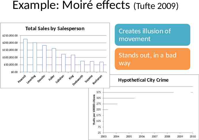
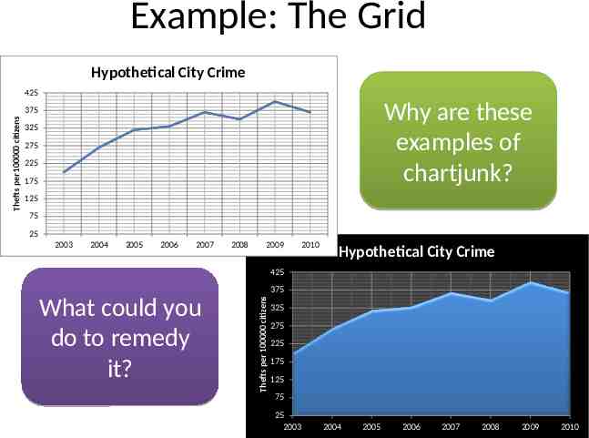
Example: Moiré effects (Tufte 2009) Total Sales by Salesperson Creates illusion of movement 250,000.00 200,000.00 150,000.00 Stands out, in a bad way 100,000.00 50,000.00 0.00 Hypothetical City Crime 425 Thefts per 100000 citizens 375 325 275 225 175 125 75 25 2003 2004 2005 2006 2007 2008 2009 2010
Example: The Grid Hypothetical City Crime 425 Why are these examples of chartjunk? 325 275 225 175 125 75 25 2003 2004 2005 2006 2007 2008 2009 2010 Hypothetical City Crime 425 375 What could you do to remedy it? Thefts per 100000 citizens Thefts per 100000 citizens 375 325 275 225 175 125 75 25 2003 2004 2005 2006 2007 2008 2009 2010
Data Ink Working For Us Evaluate this chart in terms of Data Ink. Imagine this as a bar chart. As a table!!
Review: Data principles (adapted from Tufte 2009) 1 The chart should tell a story 2 The chart should have graphical integrity 3 The chart should minimize graphical complexity Tufte’s fundamental principle: Above all else show the data
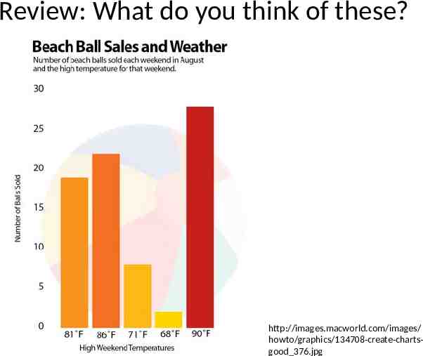
Review: What do you think of these? http://images.macworld.com/images/ howto/graphics/134708-create-chartsgood 376.jpg
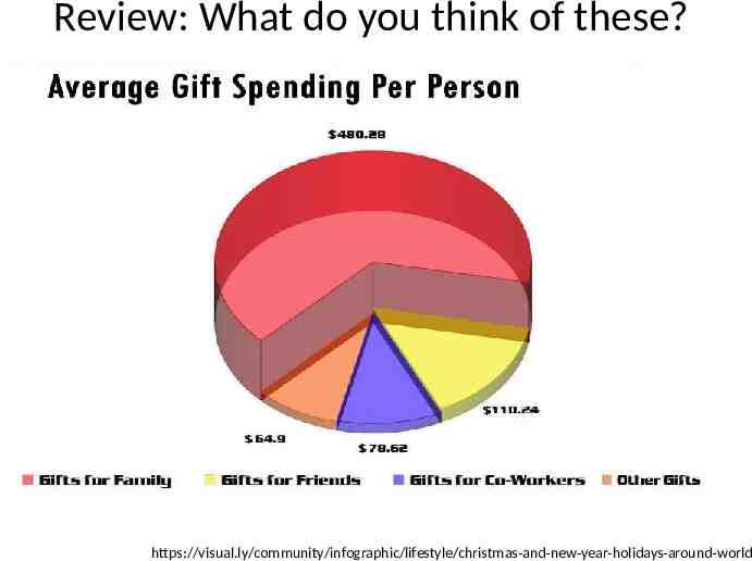
Review: What do you think of these? https://visual.ly/community/infographic/lifestyle/christmas-and-new-year-holidays-around-world
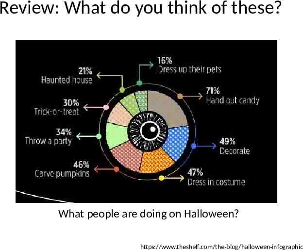
Review: What do you think of these? What people are doing on Halloween? https://www.theshelf.com/the-blog/halloween-infographic
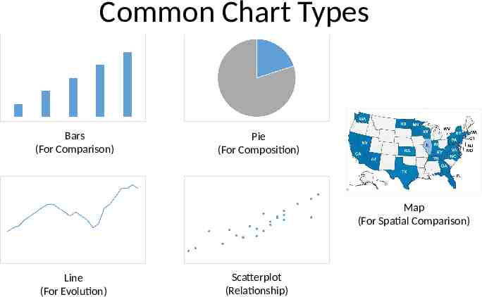
Common Chart Types Bars (For Comparison) Pie (For Composition) Map (For Spatial Comparison) Line (For Evolution) Scatterplot (Relationship)
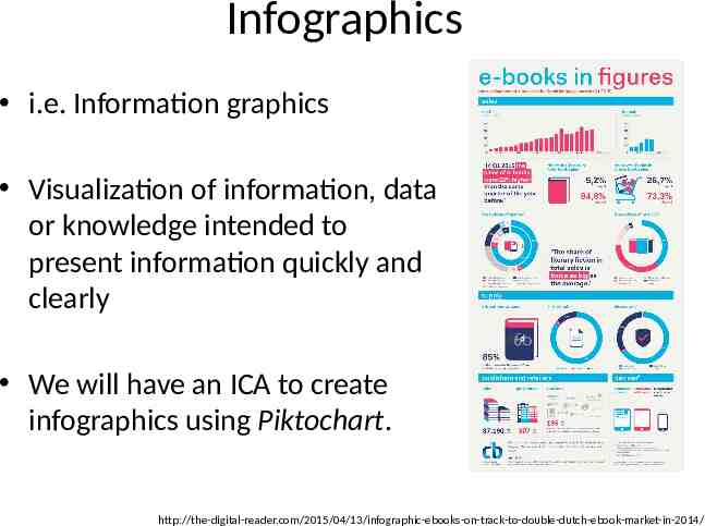
Infographics i.e. Information graphics Visualization of information, data or knowledge intended to present information quickly and clearly We will have an ICA to create infographics using Piktochart. http://the-digital-reader.com/2015/04/13/infographic-ebooks-on-track-to-double-dutch-ebook-market-in-2014/
Some Visualization Tools Excel (as always) R, Stata, Tableau, SAS (useful for Statistical Plots). Google Charts, FusionCharts (simple graphs as well as maps) Piktochart (infographics) Adobe Photoshop, Illustrator, etc (for graphical design)
Summary Use data visualization principles to assess a visualization – Tell a story – Graphical integrity (lie factor) – Minimize graphical complexity (data ink, chartjunk) Explain how a visualization can be improved based on those principles Types of visualization

