Metaphors and Styles of Human-Computer Interaction
60 Slides163.00 KB
Metaphors and Styles of Human-Computer Interaction
The psychology of metaphors Like affordances, having a metaphor can tell you how you might use something. Unlike affordances (which are direct), metaphors are indirect (require more inferences)
The psychology of metaphors a metaphor provides a lot of information it enables the transfer of skills good metaphors provide natural mappings metaphors are not taken literally they can highlight underlying assumptions metaphors are not symmetrical they can be violated
The psychology of metaphors metaphors can be mixed (e.g., windows and desktops) metaphors can be misleading (putting a disk in the trash) some things don’t seem to have any obvious metaphor (ex: UNDO) one metaphor is better than another if it leads to more correct predictions about a system’s behavior.
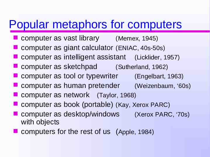
Popular metaphors for computers computer as vast library (Memex, 1945) computer as giant calculator (ENIAC, 40s-50s) computer as intelligent assistant (Licklider, 1957) computer as sketchpad (Sutherland, 1962) computer as tool or typewriter (Engelbart, 1963) computer as human pretender (Weizenbaum, ‘60s) computer as network (Taylor, 1968) computer as book (portable) (Kay, Xerox PARC) computer as desktop/windows (Xerox PARC, ‘70s) with objects computers for the rest of us (Apple, 1984)
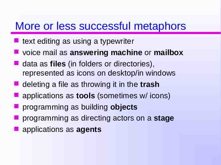
More or less successful metaphors text editing as using a typewriter voice mail as answering machine or mailbox data as files (in folders or directories), represented as icons on desktop/in windows deleting a file as throwing it in the trash applications as tools (sometimes w/ icons) programming as building objects programming as directing actors on a stage applications as agents
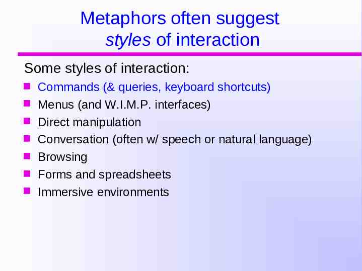
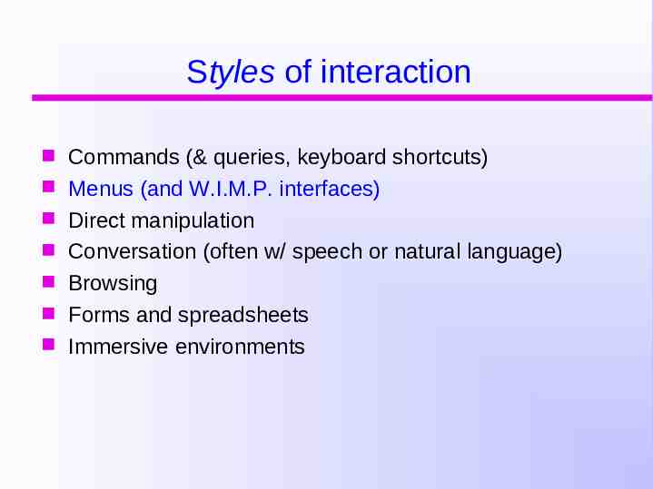
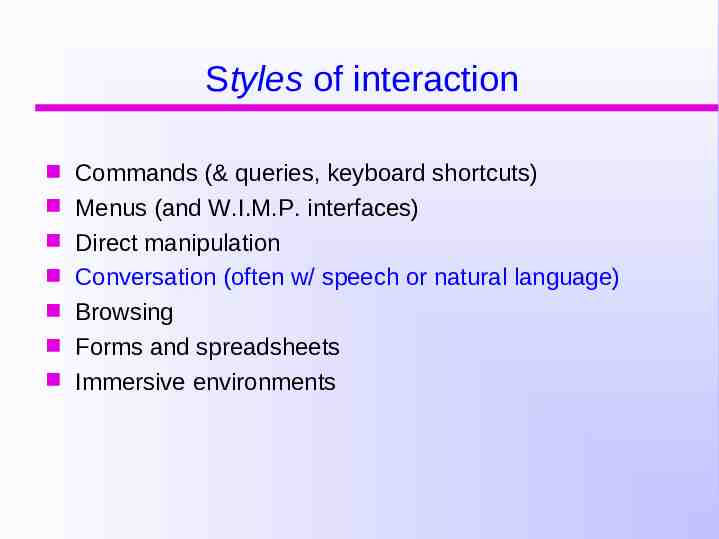
Metaphors often suggest styles of interaction Some styles of interaction: Commands (& queries, keyboard shortcuts) Menus (and W.I.M.P. interfaces) Direct manipulation Conversation (often w/ speech or natural language) Browsing Forms and spreadsheets Immersive environments
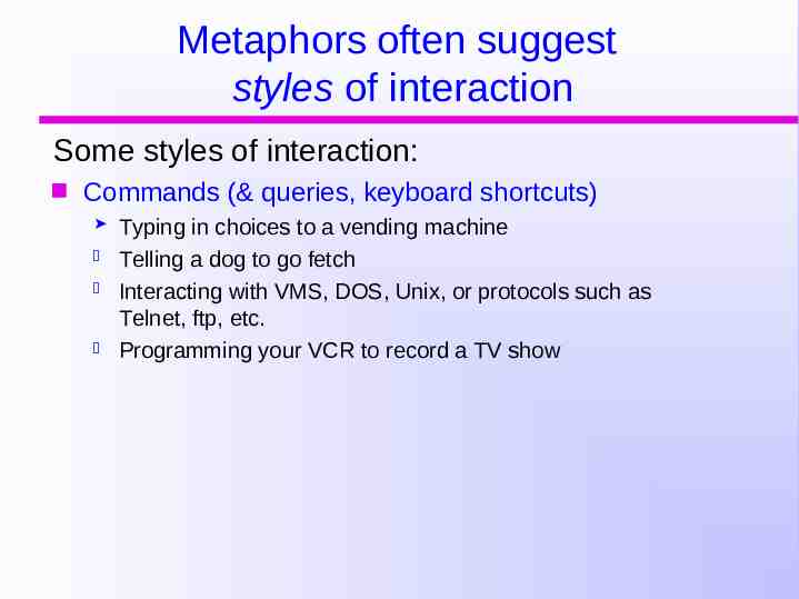
Metaphors often suggest styles of interaction Some styles of interaction: Commands (& queries, keyboard shortcuts) Typing in choices to a vending machine Telling a dog to go fetch Interacting with VMS, DOS, Unix, or protocols such as Telnet, ftp, etc. Programming your VCR to record a TV show
Command interface advantages Domain-specific language The user tells the system what to do Similar to scripting language e.g. tell the time, copy a file, save a file The user is in control (takes the initiative) Very common conceptual model for operating a device (little or no intelligence in the device) Main benefits: Powerful (especially for experts and frequent users) Supports fast and efficient interaction Good for repetitive kinds of actions
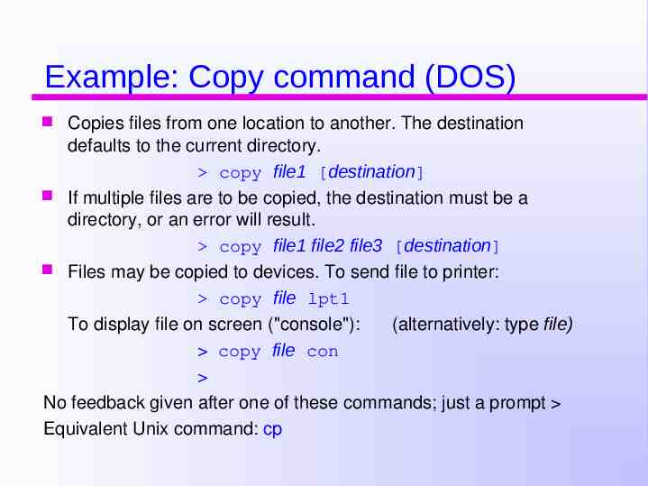
Example: Copy command (DOS) Copies files from one location to another. The destination defaults to the current directory. copy file1 [destination] If multiple files are to be copied, the destination must be a directory, or an error will result. copy file1 file2 file3 [destination] Files may be copied to devices. To send file to printer: copy file lpt1 To display file on screen ("console"): (alternatively: type file) copy file con No feedback given after one of these commands; just a prompt Equivalent Unix command: cp
Command interface drawbacks The user needs to know exactly where the information is and how it’s organized The user needs to know command syntax No tolerance whatsoever for errors Can be cryptic, especially if little feedback is given
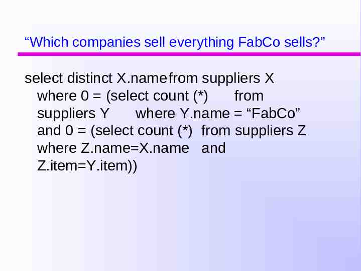
Another example: SQL queries Which companies sell everything FabCo sells? (List companies such that there does not exist an item sold by FabCo that they do not sell.)
“Which companies sell everything FabCo sells?” select distinct X.name from suppliers X where 0 (select count (*) from suppliers Y where Y.name “FabCo” and 0 (select count (*) from suppliers Z where Z.name X.name and Z.item Y.item))
“Which companies sell everything FabCo sells?” There must be an easier way!!
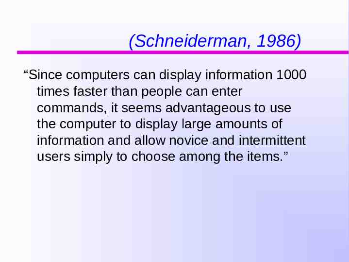
(Schneiderman, 1986) “Since computers can display information 1000 times faster than people can enter commands, it seems advantageous to use the computer to display large amounts of information and allow novice and intermittent users simply to choose among the items.”
Styles of interaction Commands (& queries, keyboard shortcuts) Menus (and W.I.M.P. interfaces) Direct manipulation Conversation (often w/ speech or natural language) Browsing Forms and spreadsheets Immersive environments
Menus Users are given predetermined choices Are often part of a WIMP interface (point & click) Windows and window managers Icons Menus Pointing devices
Menus enforce a hierarchy on the user’s goals represent well-trodden paths - you can do only what the designer envisioned You cannot filter and combine the world in novel ways
Decisions in menu design What is the task hierarchy? How to order or group items? How to trade off depth vs. breadth? What labels to choose? Whether to include shortcuts?
Menu types (not mutually exclusive) Permanent Pull-down Fall-down Pop-up Binary Extended Multiple selection Radio buttons Embedded
Styles of interaction Commands (& queries, keyboard shortcuts) Menus (and W.I.M.P. interfaces) Direct manipulation Conversation (often w/ speech or natural language) Browsing Forms and spreadsheets Immersive environments
Direct Manipulation Interfaces Representations behave as if they were the objects they represent. This reduces the distance between users and their goals. What You See Is What You Get (WYSIWYG) (Hutchins, Hollan, & Norman, 1986)
Direct manipulation Invented by Ivan Sutherland (Sketchpad, 60’s) Term was coined by Ben Shneiderman (1983) Theory developed by Hutchins, Hollan, & Norman Involves dragging, selecting, opening, closing and zooming actions on virtual objects Exploit’s users’ knowledge of how objects behave in the physical world (various metaphors) Consistent with “what you see is what you get” (WYSIWYG)
Features of direct manipulation continuous representation of the objects of interest
Features of direct manipulation continuous representation of the objects of interest physical actions, not complex syntax Example: copying a file to a diskette: copy file.txt to b:\file.txt versus dragging a file icon to a diskette icon (move vs. copy confusion)
Features of direct manipulation continuous representation of the objects of interest physical actions, not complex syntax rapid, incremental, reversible operations with immediate visual feedback
Features of direct manipulation continuous representation of the objects of interest physical actions, not complex syntax rapid, incremental, reversible operations with immediate visual feedback easy to learn, easy to remember can operate upon output representation and use it as input back to the system
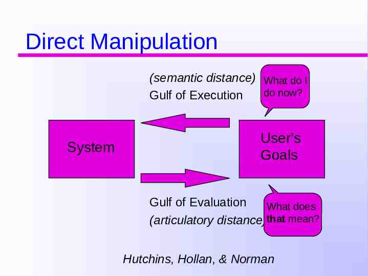
Direct Manipulation (semantic distance) What do I do now? Gulf of Execution System User’s Goals Gulf of Evaluation What does (articulatory distance)that mean? Hutchins, Hollan, & Norman
Why are DM interfaces enjoyable? Novices can learn the basic functionality quickly Experienced users can work extremely rapidly to carry out a wide range of tasks, even defining new functions Intermittent users can retain operational concepts over time Error messages are rarely encountered Users can immediately see if their actions are furthering their goals and if not, do something else Users experience less anxiety Users gain confidence and mastery and feel in control
Some problems with D.M. Sometimes: information overload or screen clutter Not all tasks can be represented by objects With DM, user is responsible for doing everything; but some tasks are better achieved by delegating! it’s hard to represent abstract things DM must function in the “here” and “now” icons can be just as cryptic as words (the Vocabulary Problem: stay tuned) e.g. spell checking repetitive actions are tedious! Moving a mouse around the screen can be slower than pressing function keys to do same actions Some DM metaphors are taken too literally
Debate about styles of interaction Direct Manipulation v. Conversation metaphors) (tool metaphors) (agent
(Schneiderman, 1986) “People are different from computers, and humanhuman interaction is not necessarily an appropriate model for human operation of computers. Since computers can display information 1000 times faster than people can enter commands, it seems advantageous to use the computer to display large amounts of information and allow novice and intermittent users simply to choose among the items.”
(Schneiderman, 1986) “People are different from computers, and humanhuman interaction is not necessarily an appropriate model for human operation of computers. Since computers can display information 1000 times faster than people can enter commands, it seems advantageous to use the computer to display large amounts of information and allow novice and intermittent users simply to choose among the items.” But what about: “Which companies sell everything FabCo sells?”
Styles of interaction Commands (& queries, keyboard shortcuts) Menus (and W.I.M.P. interfaces) Direct manipulation Conversation (often w/ speech or natural language) Browsing Forms and spreadsheets Immersive environments
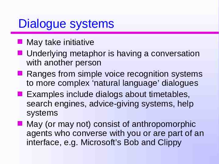
Dialogue systems May take initiative Underlying metaphor is having a conversation with another person Ranges from simple voice recognition systems to more complex ‘natural language’ dialogues Examples include dialogs about timetables, search engines, advice-giving systems, help systems May (or may not) consist of anthropomorphic agents who converse with you or are part of an interface, e.g. Microsoft’s Bob and Clippy
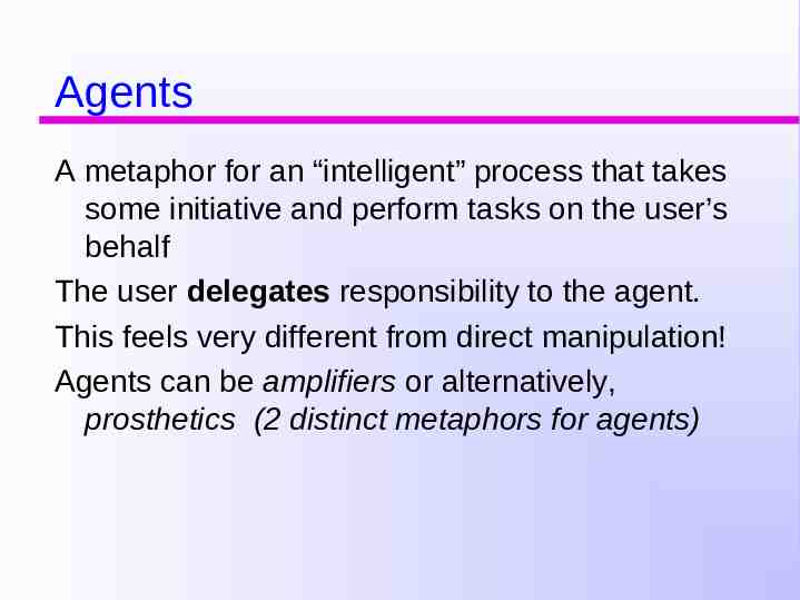
Agents A metaphor for an “intelligent” process that takes some initiative and perform tasks on the user’s behalf The user delegates responsibility to the agent. This feels very different from direct manipulation! Agents can be amplifiers or alternatively, prosthetics (2 distinct metaphors for agents)
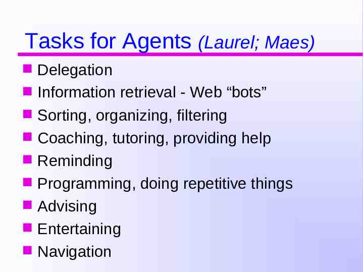
Tasks for Agents (Laurel; Maes) Delegation Information retrieval - Web “bots” Sorting, organizing, filtering Coaching, tutoring, providing help Reminding Programming, doing repetitive things Advising Entertaining Navigation
Agents (anthropomorphic or not) The most obvious metaphor for an interactive system that seems intelligent or takes initiative may be a human-like character. (But note: agents can be non-anthropomorphic as well a form can take initiative and act “intelligent” by filling in the right values automatically.)
What agent interfaces have you used?
Food for thought: To what extent is dialog with a person similar to interacting with a computer? (Shneiderman: not at all!) (Others: If the system can take the initiative and act “intelligently”, then conversation is a good metaphor for interacting with an agent.)
Should representations ever be anthopomorphic? CON: Ben Shneiderman Sherry Turkel Joseph Weizenbaum (Eliza) PRO: Brenda Laurel I say: It depends on the situation!!
Drawbacks of delegation “Intelligent” interfaces can be unpredictable. How do you come to “trust” your agent? Are anthropomorphic interfaces honest? There may be problems with anthropomorphizing an interface (Shneiderman’s arguments)
Theater and stage metaphors (Brenda Laurel; Laura Gould) Interfaces are like theater we suspend disbelief. Claim: Anthropomorphizing an interface is not a problem: People aren’t so easily fooled. (This contrasts w/ Shneiderman’s claims.)
(What do you think?)
Initiative Some kinds of human conversations are scripted - who takes the initiative is relatively fixed. In other kinds of conversation, neither person takes all the initiative. Ideally, initiative should be flexible.
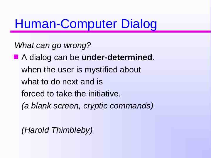
Human-Computer Dialog What can go wrong? A dialog can be under-determined. when the user is mystified about what to do next and is forced to take the initiative. (a blank screen, cryptic commands) (Harold Thimbleby)
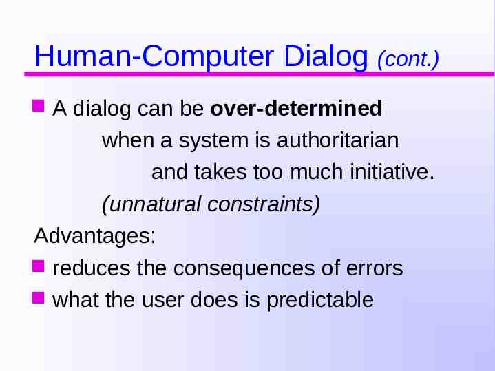
Human-Computer Dialog (cont.) A dialog can be over-determined when a system is authoritarian and takes too much initiative. (unnatural constraints) Advantages: reduces the consequences of errors what the user does is predictable
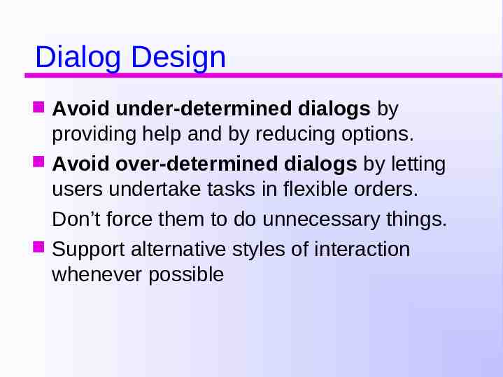
Dialog Design Avoid under-determined dialogs by providing help and by reducing options. Avoid over-determined dialogs by letting users undertake tasks in flexible orders. Don’t force them to do unnecessary things. Support alternative styles of interaction whenever possible
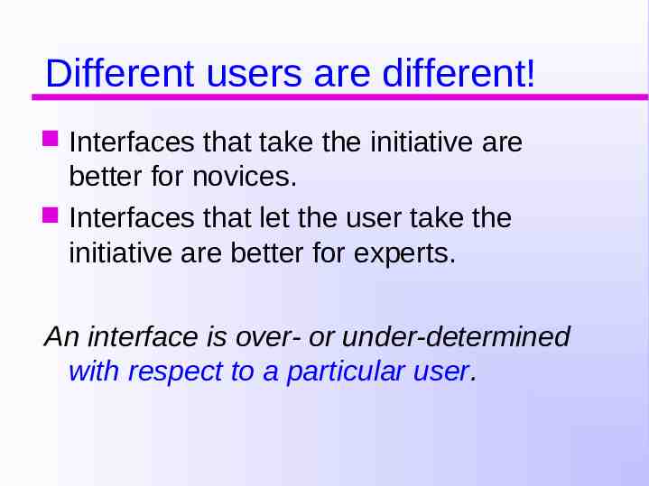
Different users are different! Interfaces that take the initiative are better for novices. Interfaces that let the user take the initiative are better for experts. An interface is over- or under-determined with respect to a particular user.
Direct manipulation and menu interfaces are sometimes (not always) over-determined. Command languages and natural language are sometimes (not always) under-determined.
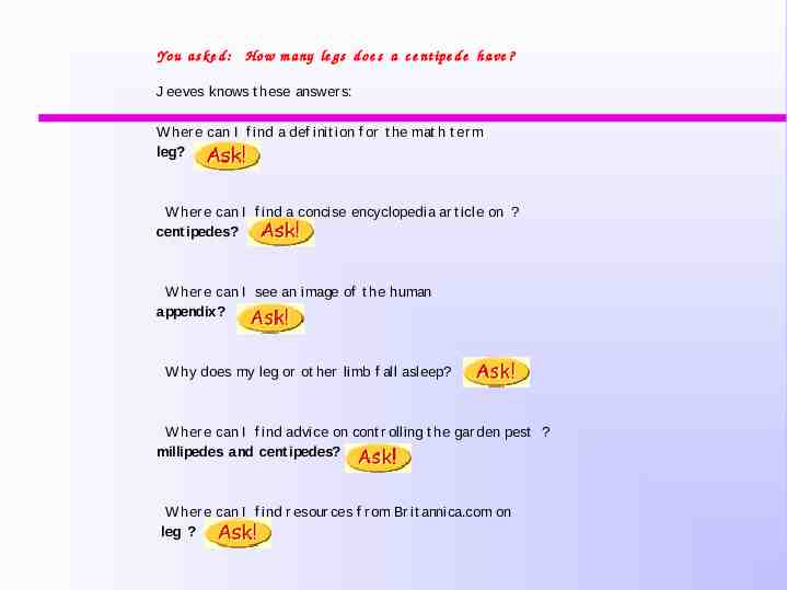
Pros & cons of conversational style of interaction Dialogue allows users, especially novices and technophobes, to interact with the system in a way that is familiar. makes them feel comfortable, at ease, not scared Misunderstandings arise when the system fails to parse what the user says. Sometimes interfaces pretend to use natural language, which can lead to problems. e.g. child types into a search engine, that uses natural language the question: “How many legs does a centipede have?” and the system responds:
Yo u a s k e d : Ho w m a ny le g s d o e s a c e nt ipe d e h a ve ? J eeves knows t hese answer s: W her e can I f ind a def init ion f or t he mat h t er m leg? W her e can I f ind a concise encyclopedia ar t icle on ? cent ipedes? W her e can I see an image of t he human appendix? W hy does my leg or ot her limb f all asleep? W her e can I f ind advice on cont r olling t he gar den pest ? millipedes and cent ipedes? W her e can I f ind r esour ces f r om Br it annica.com on leg ?
Styles of interaction Commands (& queries, keyboard shortcuts) Menus (and W.I.M.P. interfaces) Direct manipulation Conversation (often w/ speech or natural language) Browsing Forms and spreadsheets Immersive environments
Exploring and browsing Similar to how people browse information with existing media (e.g. newspapers, magazines, libraries, pamphlets) Information is structured to allow flexibility in way user is able to search for information e.g. multimedia, web Browsers, hypertext, links
Forms and spreadsheets Forms can vary from over-determined (enforcing a fixed order) to quite flexible (allowing user initiative) Spreadsheets are extremely flexible, allowing “user programming”. They can sometimes be underdetermined
Immersive environments Virtual reality (stay tuned) Often mimic real life (representations are highly literal; go well beyond metaphors)
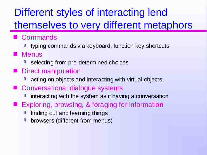
Different styles of interacting lend themselves to very different metaphors Commands Menus acting on objects and interacting with virtual objects Conversational dialogue systems selecting from pre-determined choices Direct manipulation typing commands via keyboard; function key shortcuts interacting with the system as if having a conversation Exploring, browsing, & foraging for information finding out and learning things browsers (different from menus)
Choose the right interaction style and the right metaphor Understand how the system works. (use the system yourself) (ask engineers) Figure out what problems users have. (watch them use similar systems) (create prototypes and watch users) Generate metaphors and examine their properties.
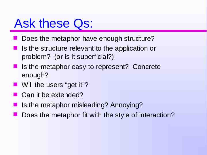
Ask these Qs: Does the metaphor have enough structure? Is the structure relevant to the application or problem? (or is it superficial?) Is the metaphor easy to represent? Concrete enough? Will the users “get it”? Can it be extended? Is the metaphor misleading? Annoying? Does the metaphor fit with the style of interaction?
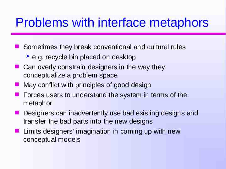
Problems with interface metaphors Sometimes they break conventional and cultural rules e.g. recycle bin placed on desktop Can overly constrain designers in the way they conceptualize a problem space May conflict with principles of good design Forces users to understand the system in terms of the metaphor Designers can inadvertently use bad existing designs and transfer the bad parts into the new designs Limits designers’ imagination in coming up with new conceptual models
