Low-fidelity Prototyping CS 160, Fall 2004 Professor John Canny
39 Slides1.40 MB
Low-fidelity Prototyping CS 160, Fall 2004 Professor John Canny 03/30/24 1
Outline Low-fidelity prototyping Wizard of OZ technique Administrivia Informal user interfaces Sketching user interfaces electronically 03/30/24 2
Why Do We Prototype? Get feedback on our design faster * saves money Experiment with alternative designs Fix problems before code is written Keep the design centered on the user 03/30/24 3
Fidelity in Prototyping Fidelity refers to the level of detail High fidelity * prototypes look like the final product Low fidelity * artists renditions with many details missing 03/30/24 4
Low-fidelity Sketches 03/30/24 5
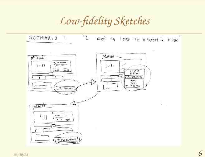
Low-fidelity Sketches 03/30/24 6
Low-fi Storyboards Where do storyboards come from? * Film & animation Give you a “script” of important events * leave out the details * concentrate on the important interactions 03/30/24 7
03/30/24 8
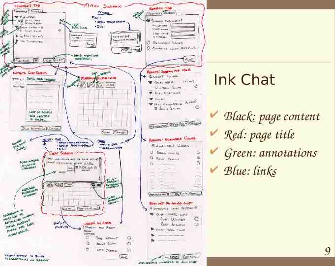
Ink Chat 03/30/24 Black: page content Red: page title Green: annotations Blue: links 9
Why Use Low-fi Prototypes? Traditional methods take too long * sketches - prototype - evaluate - iterate Can simulate the prototype * sketches - evaluate - iterate * sketches act as prototypes designer “plays computer” other design team members observe & record Kindergarten implementation skills * allows non-programmers to participate in the design process 03/30/24 10
Hi-fi Prototypes Distort: Perceptions of the tester/reviewer? * formal representation indicates “finished” nature comments on color, fonts, and alignment Time? * encourage precision specifying details takes more time Creativity? * lose track of the big picture 03/30/24 11
The Basic Materials Large, heavy, white paper (11 x 17) 5x8 in. index cards Tape, stick glue, correction tape Pens & markers (many colors & sizes) Overhead transparencies (for small items) Scissors, X-acto knives, etc. Sources: Office Depot, “The Art Store”, 03/30/24 12
Constructing the Model Set a deadline * don’t think too long - build it! Draw a window frame on large paper Put different screen regions on cards * anything that moves, changes, appears/disappears Ready response for any user action * e.g., have those pull-down menus already made Use photocopier to make many versions 03/30/24 14
Preparing for a Test Select your users * understand background of intended users * use a questionnaire to get the people you need * don’t use friends or family Prepare scenarios that are * typical of the product during actual use * make prototype support these (small, yet broad) Practice to avoid “bugs” in the system 03/30/24 15
Preparing for a Test Create “informed consent” forms: Explain who you are, and what the goal of your experiment is. Include phrases like: * * * * * This is not part of your (class or job) evaluation You can quit at any time Your name will not be included in any reports Identifying data will be anonymized Participation is voluntary 03/30/24 16
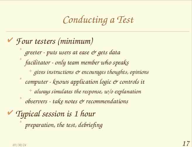
Conducting a Test Four testers (minimum) * greeter - puts users at ease & gets data * facilitator - only team member who speaks gives instructions & encourages thoughts, opinions * computer - knows application logic & controls it always simulates the response, w/o explanation * observers - take notes & recommendations Typical session is 1 hour * preparation, the test, debriefing 03/30/24 17
Conducting a Test (cont.) Greet * get forms filled, assure confidentiality, etc. Test * facilitator hands written tasks to the user must be clear & detailed * facilitator keeps getting “output” from participant “What are you thinking right now?”, “Think aloud” * observe - avoid strong reactions: laugh, gape, etc. 03/30/24 18
Conducting a Test (cont.) Debrief * * * * fill out post-evaluation questionnaire ask questions about parts you saw problems on gather impressions give thanks 03/30/24 19
Evaluating Results Sort & prioritize observations * what was important? * lots of problems in the same area? Create a written report on findings * gives agenda for meeting on design changes Make changes & iterate 03/30/24 20
Advantages of Low-fi Prototyping Takes only a few hours * no expensive equipment needed Can test multiple alternatives * fast iterations number of iterations is tied to final quality Almost all interaction can be faked 03/30/24 21
Wizard of Oz Technique Faking the interaction. Comes from? * from the film “The Wizard of OZ” “the man behind the curtain” Long tradition in computer industry * prototype of a PC w/ a VAX behind the curtain Much more important for hard to implement features * Speech & handwriting recognition 03/30/24 22
Wizard of Oz Tips Rehearse your actions * For a complicated UI, make a flowchart which is hidden from the user * Make list of legal words for a speech interface Stay “in role” * You are a computer, and have no common sense, or ability to understand spoken English. Facilitator can remind user of the rules if the user gets stuck 03/30/24 23
Administrivia Contextual inquiry (or explanation) due today Break 03/30/24 24
Research on UI Design tools “Design Exploration Phase” Brainstorming * put designs in a tangible form * consider different ideas rapidly Incomplete designs * do not need to cover all cases * illustrate important examples Present several designs to client 03/30/24 25
Goal of Research in Informal UI Design Tools Allow designers to * quickly sketch interface ideas * test these ideas with users * transform to a more finished design without reprogramming 03/30/24 26
Drawbacks of Current Tools Examples: Visual Basic Viseo Visual C 03/30/24 27
Drawbacks of Current Tools Require specification of lots of detail * must give specific instance of a general idea e.g., exact widgets, fonts, alignments, colors * designers led to focus on unimportant details Take too much time to use * poor support for iterative design sketched interface took 5 times longer with traditional tool (no icons) 03/30/24 28
Paper Sketches Advantages * support brainstorming * do not require specification of details * designers feel comfortable sketching Drawbacks * * * * 03/30/24 do not evolve easily lack support for “design memory” force manual translation to electronic format do not allow end-user interaction 29
What is SILK? Sketching Interfaces Like Krazy 03/30/24 30
Quickly Sketch this. 03/30/24 31
Add Behavior. 03/30/24 32
Designing Interfaces with SILK 1)Designer sketches ideas rapidly with electronic pad and pen * SILK recognizes widgets * easy editing with gestures 2)Designer or end-user tests interface * widgets behave * specify additional behavior visually 3)Automatically transforms to a “finished” UI * downplayed now 03/30/24 33
Designing Interfaces with SILK Behavior of widgets takes over some of the tedious aspects of Woz: * Recognizing and reacting to commands * Moving dialog boxes around * Following a script/flowchart 03/30/24 34
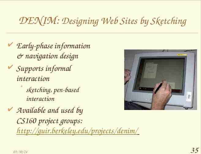
DENIM: Designing Web Sites by Sketching Early-phase information & navigation design Supports informal interaction * sketching, pen-based interaction Available and used by CS160 project groups: http://guir.berkeley.edu/projects/denim/ 03/30/24 35
DENIM: Designing Web Sites by Sketching DENIM’s features are based on interviews with many designers. 03/30/24 36
DENIM: Designing Web Sites by Sketching DENIM supports navigation between pages, at both page and anchor level. It has multiple “scale” views for the entire site, part of the site, a pair of pages, a single page, or part of a page. 03/30/24 37
Closing There is a down-side to the informal design approach: Often hard to involve paying clients as subjects – they treat the fidelity of the interface as a sign of development effort. 03/30/24 38
Summary Informal prototypes allow you to design (and test!) before writing code. Rapid evolution and elimination of many problems happens in this phase. Paper ink is the traditional tool, some emerging research tools (SILK, DENIM) also support informal design. 03/30/24 39
