i247: Information Visualization and Presentation Cecilia Aragon Types
36 Slides2.68 MB
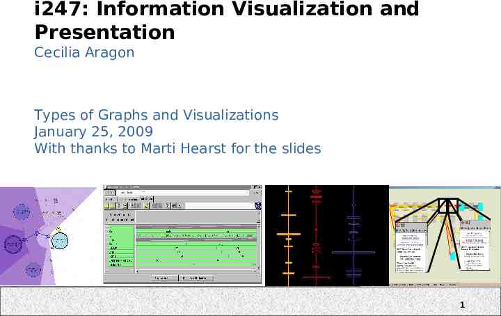
i247: Information Visualization and Presentation Cecilia Aragon Types of Graphs and Visualizations January 25, 2009 With thanks to Marti Hearst for the slides 1
Course Goals Students will be able to: – Describe the key design guidelines and techniques for visual display of information, including the relationship to human perception. – Design interactive visualizations to support thought, understanding, and insight, using real data. – Explore and critically evaluate visualization techniques and applications. Adapted from Stone & Zellweger 2
What are your course goals? 3
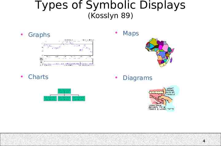
Types of Symbolic Displays (Kosslyn 89) Graphs Maps Charts Diagrams T y p e n a m e h e re T y p e t it le h e re T y p e n a m e h e re T y p e t it le h e re T y p e n a m e h e re T y p e t it le h e re T y p e n a m e h e re T y p e t it le h e re 4
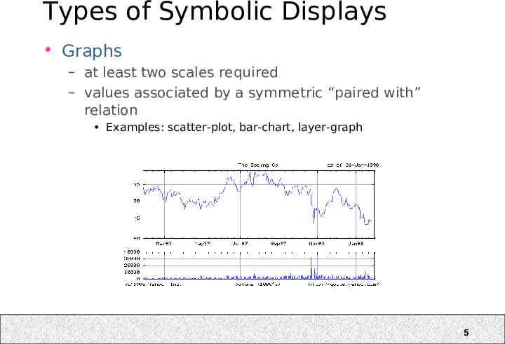
Types of Symbolic Displays Graphs – at least two scales required – values associated by a symmetric “paired with” relation Examples: scatter-plot, bar-chart, layer-graph 5
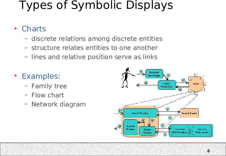
Types of Symbolic Displays Charts – discrete relations among discrete entities – structure relates entities to one another – lines and relative position serve as links Examples: – Family tree – Flow chart – Network diagram 6
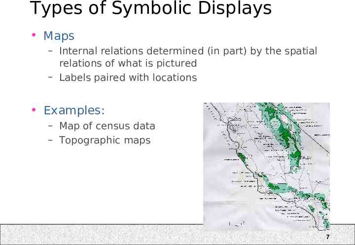
Types of Symbolic Displays Maps – Internal relations determined (in part) by the spatial relations of what is pictured – Labels paired with locations Examples: – Map of census data – Topographic maps 7
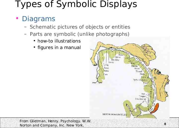
Types of Symbolic Displays Diagrams – Schematic pictures of objects or entities – Parts are symbolic (unlike photographs) how-to illustrations figures in a manual From Glietman, Henry. Psychology. W.W. Norton and Company, Inc. New York, 8
What is the “real” taxonomy for visual representations? An empirical investigation by Lohse et al.’94 – (Only used static, 2D graphics) – 16 participants Half had a graphic design background – First, looked at 60 images and scored them along 10 scales. These were used to compute statistical similarity – Then, organized the 60 images into categories according to similarity. Were asked to name the groups Then they grouped these into higher-level groups, repeatedly, until they were in one large group. Lohse, G L; Biolsi, K; Walker, N and H H Rueter, A Classification of Visual Representations, CACM, Vol. 37, No. 12, pp 36-49, 1994 9
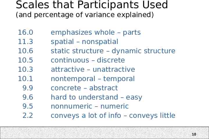
Scales that Participants Used (and percentage of variance explained) 16.0 11.3 10.6 10.5 10.3 10.1 9.9 9.6 9.5 2.2 emphasizes whole – parts spatial – nonspatial static structure – dynamic structure continuous – discrete attractive – unattractive nontemporal – temporal concrete – abstract hard to understand – easy nonnumeric – numeric conveys a lot of info – conveys little 10
Resulting Categories (Lohse et al. 94) Graphs Tables (numerical) Tables (graphical) Charts (time) Charts (network) Diagrams (structure) Diagrams (network) Maps Cartograms Icons Photo-realistic images 11
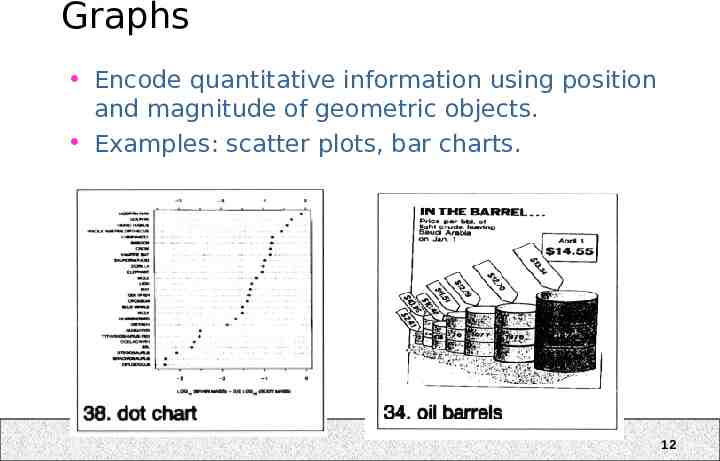
Graphs Encode quantitative information using position and magnitude of geometric objects. Examples: scatter plots, bar charts. 12
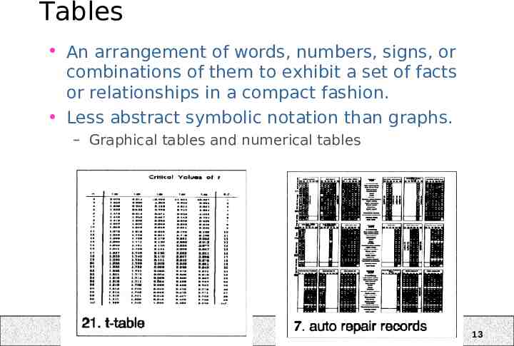
Tables An arrangement of words, numbers, signs, or combinations of them to exhibit a set of facts or relationships in a compact fashion. Less abstract symbolic notation than graphs. – Graphical tables and numerical tables 13
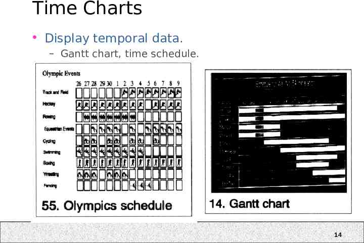
Time Charts Display temporal data. – Gantt chart, time schedule. 14
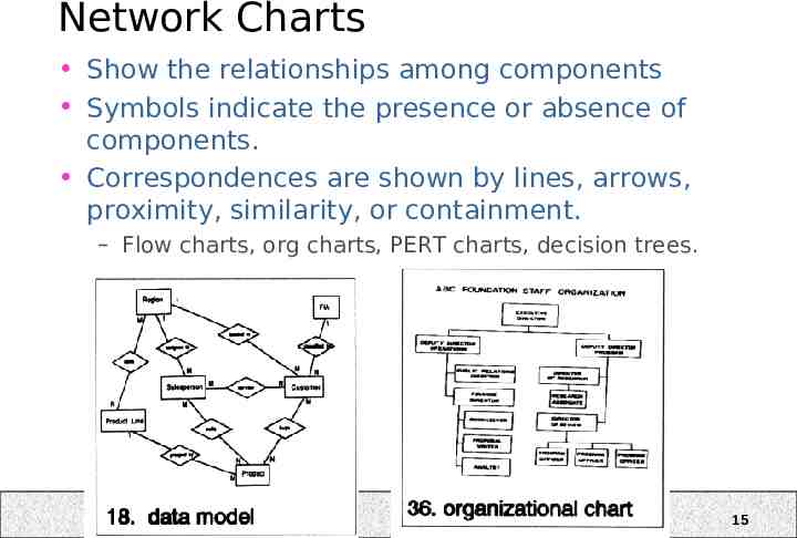
Network Charts Show the relationships among components Symbols indicate the presence or absence of components. Correspondences are shown by lines, arrows, proximity, similarity, or containment. – Flow charts, org charts, PERT charts, decision trees. 15
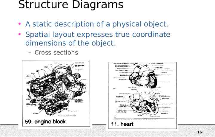
Structure Diagrams A static description of a physical object. Spatial layout expresses true coordinate dimensions of the object. – Cross-sections 16
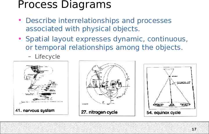
Process Diagrams Describe interrelationships and processes associated with physical objects. Spatial layout expresses dynamic, continuous, or temporal relationships among the objects. – Lifecycle 17
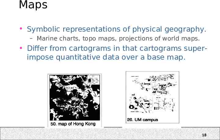
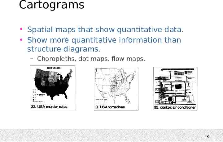
Maps Symbolic representations of physical geography. – Marine charts, topo maps, projections of world maps. Differ from cartograms in that cartograms superimpose quantitative data over a base map. 18
Cartograms Spatial maps that show quantitative data. Show more quantitative information than structure diagrams. – Choropleths, dot maps, flow maps. 19
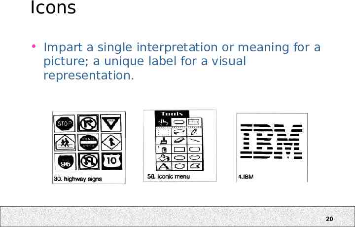
Icons Impart a single interpretation or meaning for a picture; a unique label for a visual representation. 20
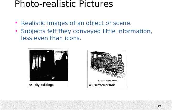
Photo-realistic Pictures Realistic images of an object or scene. Subjects felt they conveyed little information, less even than icons. 21
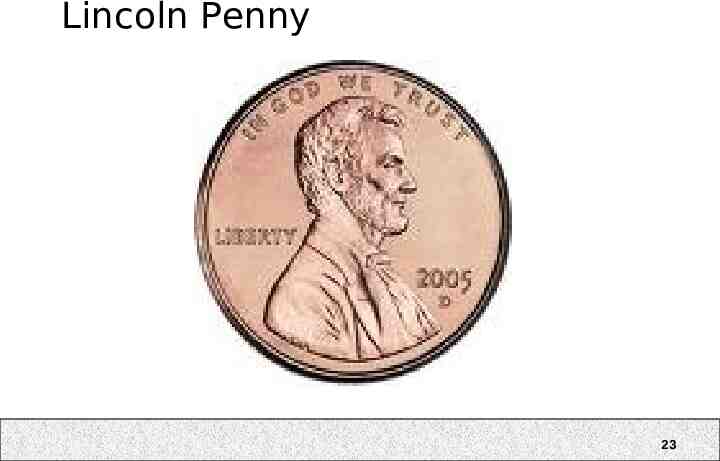
Lincoln Penny 22
Lincoln Penny 23
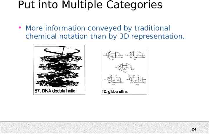
Put into Multiple Categories More information conveyed by traditional chemical notation than by 3D representation. 24
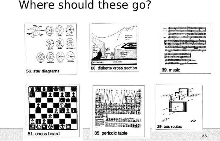
Where should these go? 25
Effects of graphic arts training Conflicting studies for expert-novice differences in visual information processing DeSanctis and Jarvenpaa, 1989: practice improves ability to decode information from graphs Egan and Schwartz, 1979: chunking of symbols facilitates memory reconstruction 26
Other Findings (Lohse et al. 94) Photorealistic images were least informative – Echos results in icon studies – better to use less complex, more schematic images Graphs and tables are the most self-similar categories – Results in the literature comparing these are inconclusive Cartograms were hard to understand – Echos other results – better to put points into a framed rectangle to aid spatial perception Temporal data more difficult to show than cyclic data – Recommend using animation for temporal data 27
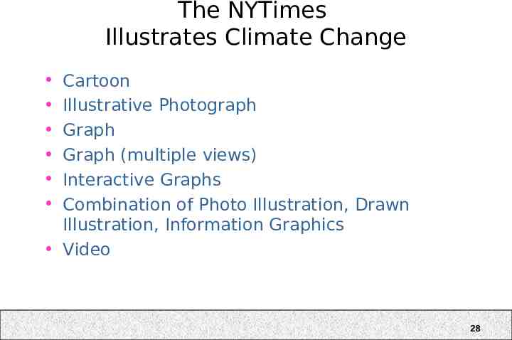
The NYTimes Illustrates Climate Change Cartoon Illustrative Photograph Graph Graph (multiple views) Interactive Graphs Combination of Photo Illustration, Drawn Illustration, Information Graphics Video 28
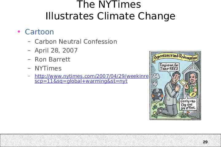
The NYTimes Illustrates Climate Change Cartoon – – – – Carbon Neutral Confession April 28, 2007 Ron Barrett NYTimes – http://www.nytimes.com/2007/04/29/weekinreview/29revkin.html? scp 11&sq global warming&st nyt 29
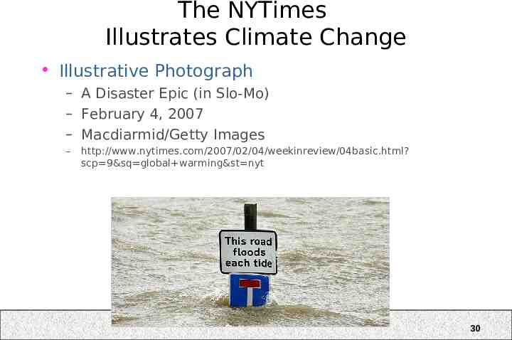
The NYTimes Illustrates Climate Change Illustrative Photograph – A Disaster Epic (in Slo-Mo) – February 4, 2007 – Macdiarmid/Getty Images – http://www.nytimes.com/2007/02/04/weekinreview/04basic.html? scp 9&sq global warming&st nyt 30
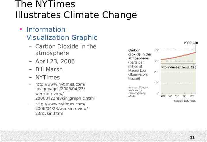
The NYTimes Illustrates Climate Change Information Visualization Graphic – Carbon Dioxide in the atmosphere – April 23, 2006 – Bill Marsh – NYTimes – – http://www.nytimes.com/ imagepages/2006/04/23/ weekinreview/ 20060423revkin graphic.html http://www.nytimes.com/ 2006/04/23/weekinreview/ 23revkin.html 31
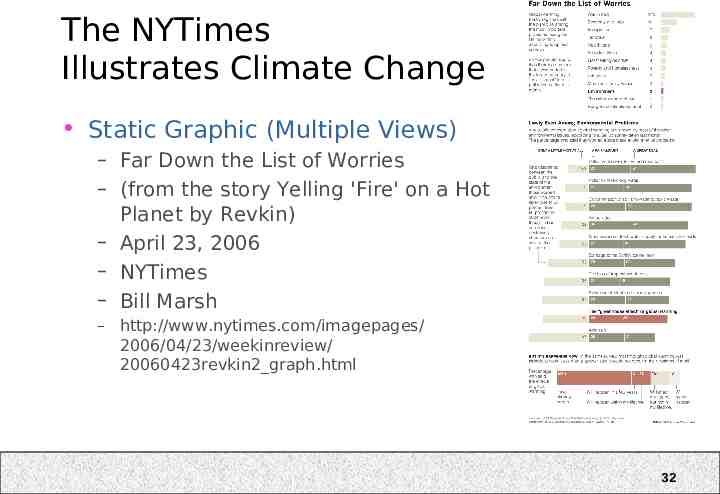
The NYTimes Illustrates Climate Change Static Graphic (Multiple Views) – Far Down the List of Worries – (from the story Yelling 'Fire' on a Hot Planet by Revkin) – April 23, 2006 – NYTimes – Bill Marsh – http://www.nytimes.com/imagepages/ 2006/04/23/weekinreview/ 20060423revkin2 graph.html 32
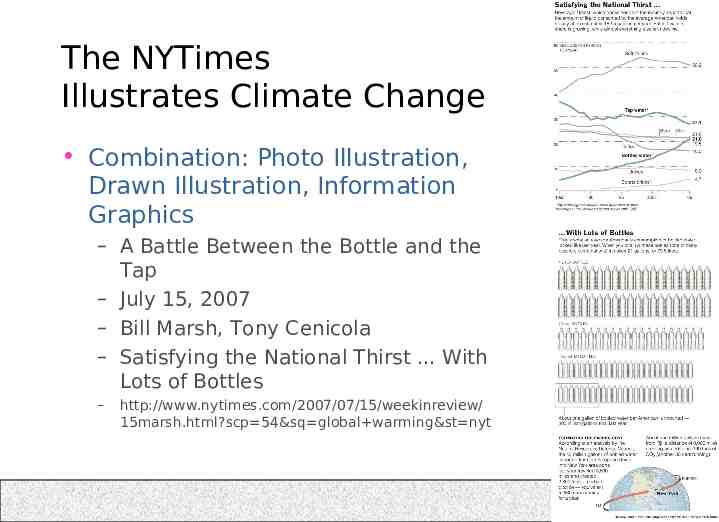
The NYTimes Illustrates Climate Change Combination: Photo Illustration, Drawn Illustration, Information Graphics – A Battle Between the Bottle and the Tap – July 15, 2007 – Bill Marsh, Tony Cenicola – Satisfying the National Thirst . With Lots of Bottles – http://www.nytimes.com/2007/07/15/weekinreview/ 15marsh.html?scp 54&sq global warming&st nyt 33
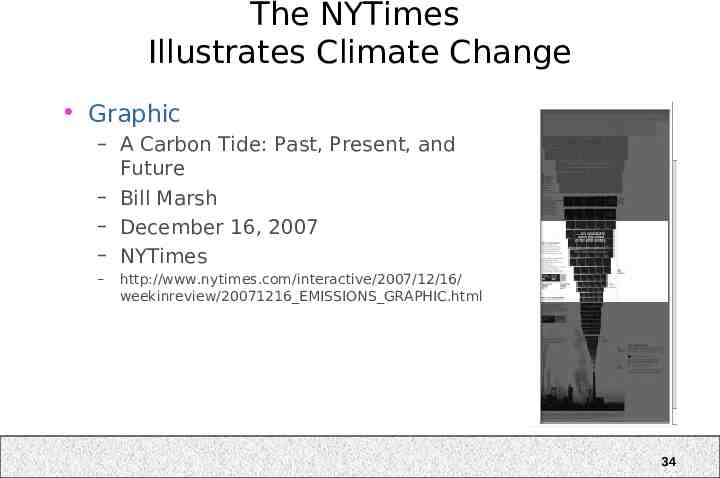
The NYTimes Illustrates Climate Change Graphic – A Carbon Tide: Past, Present, and Future – Bill Marsh – December 16, 2007 – NYTimes – http://www.nytimes.com/interactive/2007/12/16/ weekinreview/20071216 EMISSIONS GRAPHIC.html 34
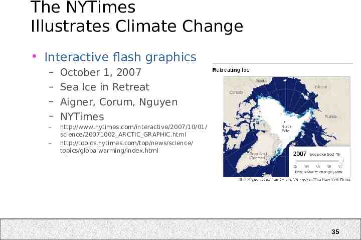
The NYTimes Illustrates Climate Change Interactive flash graphics – – – – October 1, 2007 Sea Ice in Retreat Aigner, Corum, Nguyen NYTimes – http://www.nytimes.com/interactive/2007/10/01/ science/20071002 ARCTIC GRAPHIC.html http://topics.nytimes.com/top/news/science/ topics/globalwarming/index.html – 35
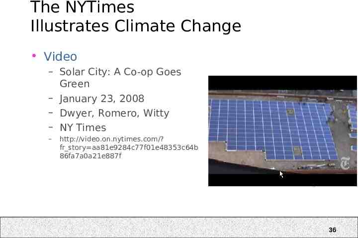
The NYTimes Illustrates Climate Change Video – Solar City: A Co-op Goes Green – January 23, 2008 – Dwyer, Romero, Witty – NY Times – http://video.on.nytimes.com/? fr story aa81e9284c77f01e48353c64b 86fa7a0a21e887f 36
