Human factors in interaction design
74 Slides603.50 KB
Human factors in interaction design
Projects Project Phase One reports are due in one month: November 25. Submit your report via ODTU-Class You are going to have 1.5 months after Phase One to finish your project and present it in class.
Projects What do I want to see in Phase One reports apart from a general description? – Description of your potential users Age, gender, physical and cognitive abilities, education, cultural or ethnic background, training, motivation, goals and personality Skill level of your users: Novice or first-time users, Knowledgeable users, or expert frequent users – Identification of the tasks Users’ needs? Observing and interviewing users Decomposition of high level tasks Relative task frequencies
Projects – What type of interaction style will be employed? Natural language, speech? Vision? Touch gestures? Mobile sensors? – Which tools (software/hardware) are you planning to use in your project?
Many kinds of interaction styles available Command Speech Data-entry Form fill-in Query Graphical Web Pen Augmented reality Gesture and even.
for Human–Computer Interaction understand your materials understand computers – limitations, capacities, tools, platforms understand people – psychological, social aspects – human error and their interaction
Usability measures 5 human factors central to interface evaluation: – Time to learn How long does it take for typical members of the community to learn relevant task? – Speed of performance How long does it take to perform relevant benchmarks? – Rate of errors by users How many and what kinds of errors are made during benchmark tasks? – Retention over time Frequency of use and ease of learning – Subjective satisfaction Allow for user feedback via interviews, free-form comments and satisfaction scales
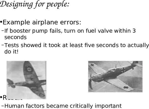
Designing for people: Example airplane errors: – If booster pump fails, turn on fuel valve within 3 seconds – Tests showed it took at least five seconds to actually do it! Result – Human factors became critically important
Differences Between The Designer And Operator Darn these hooves! I hit the wrong switch again! Who designs these instrument panels, raccoons?
The human Information i/o – visual, auditory, haptic, movement Information stored in memory – sensory, short-term, long-term Information processed and applied – reasoning, problem solving, skill, error Emotion influences human capabilities Each person is different
Core cognitive aspects Attention Perception and recognition Memory Reading, speaking and listening Problem-solving, planning, reasoning and decision-making, learning
Vision Two stages in vision physical reception of stimulus processing and interpretation of stimulus
The Eye - physical reception mechanism for receiving light and transforming it into electrical energy light reflects from objects images are focused upside-down on retina retina contains rods for low light vision and cones for color vision ganglion cells (brain!) detect pattern and movement
Interpreting the signal Size and depth – visual angle indicates how much of view object occupies (relates to size and distance from eye) – visual acuity is the ability to perceive detail (limited) – familiar objects perceived as constant size away) (in spite of changes in visual angle when far – cues like overlapping help perception of size and depth
Interpreting the signal (cont) Brightness – – – – subjective reaction to levels of light affected by luminance of object measured by just noticeable difference visual acuity increases with luminance as does flicker Color – – – – made up of hue, intensity, saturation cones sensitive to color wavelengths blue acuity is lowest 8% males and 1% females color blind
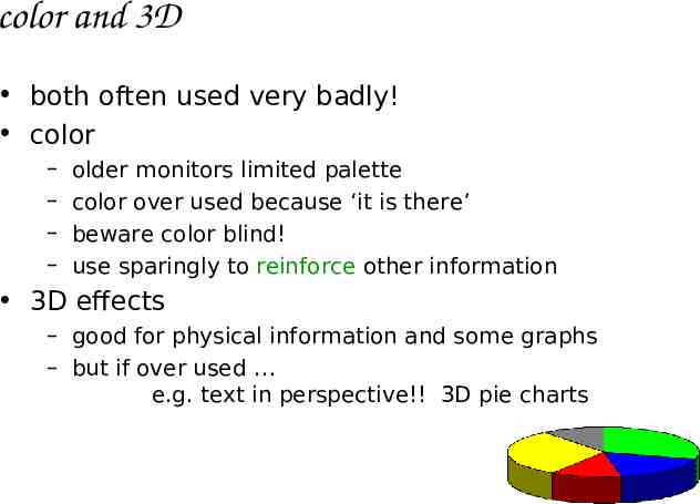
color and 3D both often used very badly! color – – – – older monitors limited palette color over used because ‘it is there’ beware color blind! use sparingly to reinforce other information 3D effects – good for physical information and some graphs – but if over used e.g. text in perspective!! 3D pie charts
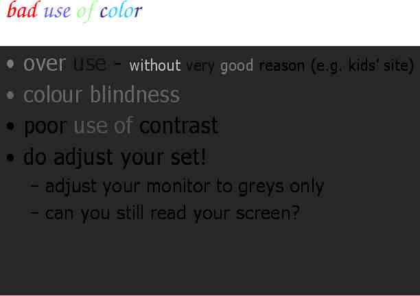
bad use of color over use - without very good reason (e.g. kids’ site) colour blindness poor use of contrast do adjust your set! – adjust your monitor to greys only – can you still read your screen?
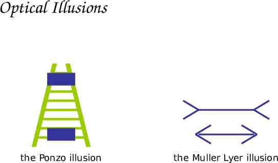
Interpreting the signal (cont) The visual system compensates for: – movement – changes in luminance. Context is used to resolve ambiguity Optical illusions sometimes occur due to over compensation
Optical Illusions the Ponzo illusion the Muller Lyer illusion
Reading Several stages: – visual pattern perceived – decoded using internal representation of language – interpreted using knowledge of syntax, semantics, pragmatics Reading involves saccades and fixations Perception occurs during fixations Word shape is important to recognition Negative contrast improves reading from computer screen
Hearing Provides information about environment: distances, directions, objects etc. Physical apparatus: – outer ear – middle ear – inner ear nerve – protects inner and amplifies sound – transmits sound waves as vibrations to inner ear – chemical transmitters are released and cause impulses in auditory Sound – pitch – – loudness – timbre– sound frequency – amplitude type or quality
Hearing (cont) Humans can hear frequencies from 20Hz to 15kHz – less accurate distinguishing high frequencies than low. Auditory system filters sounds – can attend to sounds over background noise.
Touch Provides important feedback about environment. May be key sense for someone who is visually impaired. Stimulus received via receptors in the skin: – thermoreceptors – nociceptors – pain – mechanoreceptors – heat and cold – pressure (some instant, some continuous) Some areas more sensitive than others e.g. fingers. Kinethesis - awareness of body position – affects comfort and performance.
Movement Time taken to respond to stimulus: reaction time movement time Movement time dependent on age, fitness etc. Reaction time - dependent on stimulus type: – visual – auditory – pain 200ms 150 ms 700ms
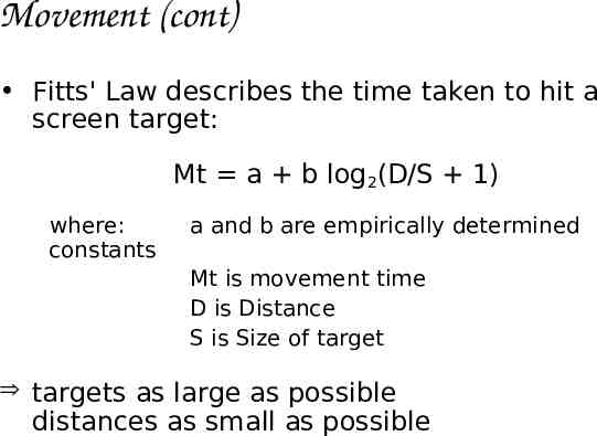
Movement (cont) Fitts' Law describes the time taken to hit a screen target: Mt a b log2(D/S 1) where: constants a and b are empirically determined Mt is movement time D is Distance S is Size of target targets as large as possible distances as small as possible
Attention Selecting things to concentrate on from the mass around us, at a point in time Focussed and divided attention enables us to be selective in terms of the mass of competing stimuli but limits our ability to keep track of all events – magicians use this to their advantage! Information at the interface should be structured to capture users’ attention, e.g. use perceptual boundaries (windows), color, reverse video, sound and flashing lights
Design implications for attention Make information salient when it needs attending to Use techniques that make things stand out like color, ordering, spacing, underlining, sequencing and animation Avoid cluttering the interface - follow the google.com example of crisp, simple design Avoid using too much because the software allows it
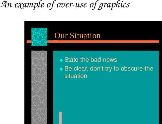
An example of over-use of graphics Our Situation State the bad news Be clear, don’t try to obscure the situation
Perception and recognition How information is acquired from the world and transformed into experiences Obvious implication is to design representations that are readily perceivable, e.g. – Text should be legible – Icons should be easy to distinguish and read
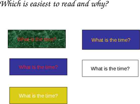
Which is easiest to read and why? What is the time? What is the time? What is the time? What is the time? What is the time?
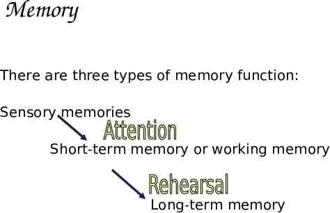
Memory There are three types of memory function: Sensory memories Short-term memory or working memory Long-term memory
Memory Involves encoding and recalling knowledge and acting appropriately We don’t remember everything - involves filtering and processing Context is important in affecting our memory We recognize things much better than being able to recall things – The rise of the GUI over command-based interfaces Better at remembering images than words – The use of icons rather than names
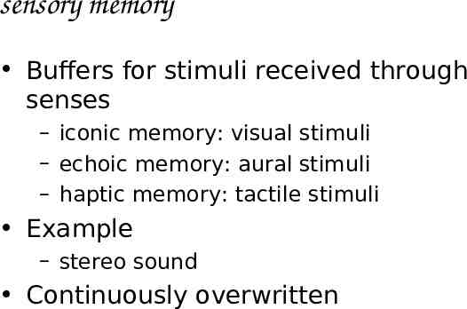
sensory memory Buffers for stimuli received through senses – iconic memory: visual stimuli – echoic memory: aural stimuli – haptic memory: tactile stimuli Example – stereo sound Continuously overwritten
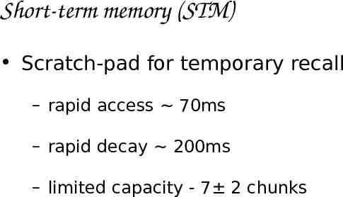
Short-term memory (STM) Scratch-pad for temporary recall – rapid access 70ms – rapid decay 200ms – limited capacity - 7 2 chunks
Examples 212348278493202 0121 414 2626 HEC ATR ANU PTH ETR EET
The problem with the classic ‘7 2’ George Miller’s theory of how much information people can remember People’s immediate memory capacity is very limited Many designers have been led to believe that this is useful finding for interaction design
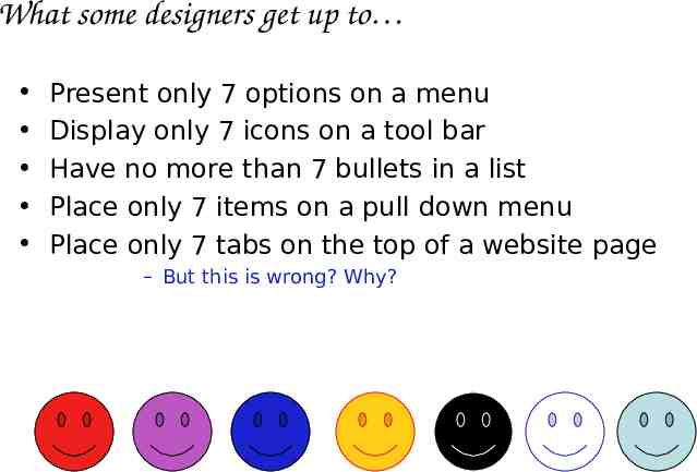
What some designers get up to Present only 7 options on a menu Display only 7 icons on a tool bar Have no more than 7 bullets in a list Place only 7 items on a pull down menu Place only 7 tabs on the top of a website page – But this is wrong? Why?
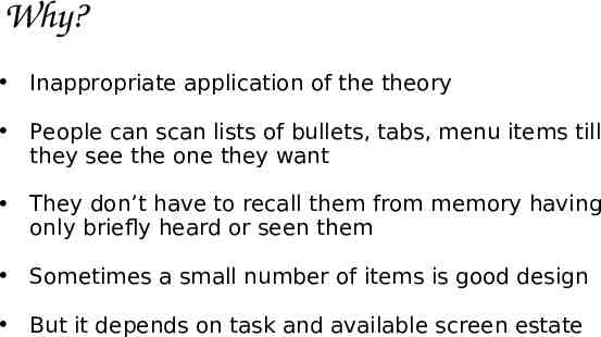
Why? Inappropriate application of the theory People can scan lists of bullets, tabs, menu items till they see the one they want They don’t have to recall them from memory having only briefly heard or seen them Sometimes a small number of items is good design But it depends on task and available screen estate
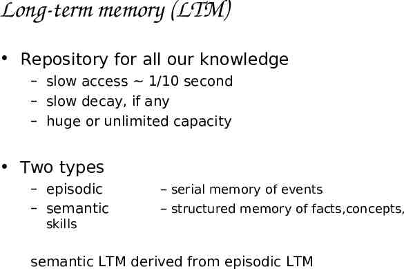
Long-term memory (LTM) Repository for all our knowledge – slow access 1/10 second – slow decay, if any – huge or unlimited capacity Two types – episodic – semantic – serial memory of events – structured memory of facts,concepts, skills semantic LTM derived from episodic LTM
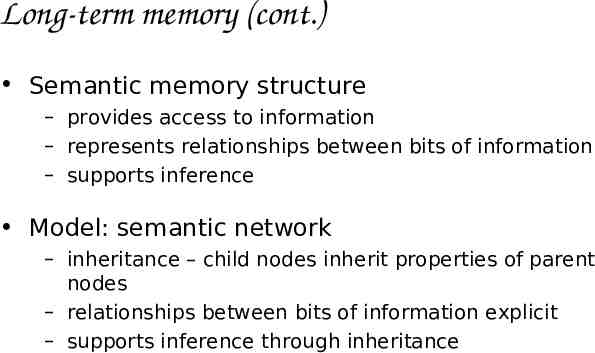
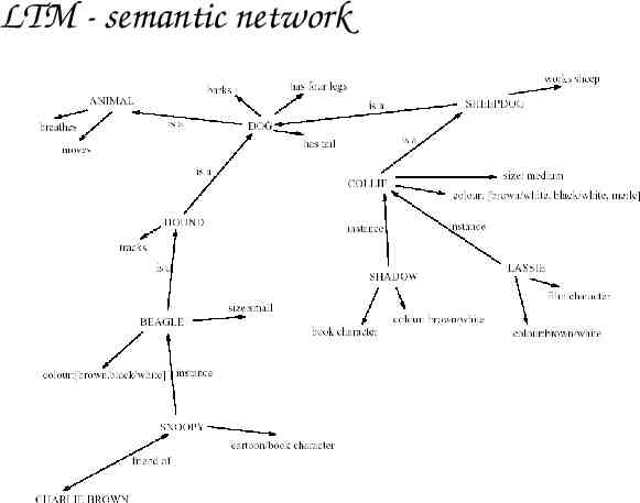
Long-term memory (cont.) Semantic memory structure – provides access to information – represents relationships between bits of information – supports inference Model: semantic network – inheritance – child nodes inherit properties of parent nodes – relationships between bits of information explicit – supports inference through inheritance
LTM - semantic network
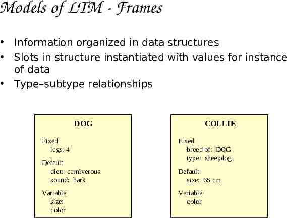
Models of LTM - Frames Information organized in data structures Slots in structure instantiated with values for instance of data Type–subtype relationships DOG Fixed legs: 4 Default diet: carniverous sound: bark Variable size: color COLLIE Fixed breed of: DOG type: sheepdog Default size: 65 cm Variable color
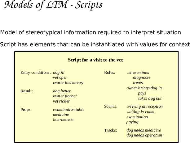
Models of LTM - Scripts Model of stereotypical information required to interpret situation Script has elements that can be instantiated with values for context Script for a visit to the vet Entry conditions: dog ill vet open owner has money Result: dog better owner poorer vet richer Props: examination table medicine instruments Roles: vet examines diagnoses treats owner brings dog in pays takes dog out Scenes: arriving at reception waiting in room examination paying Tracks: dog needs medicine dog needs operation
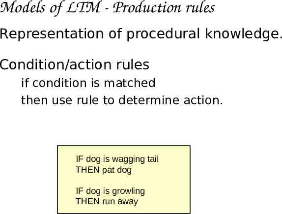
Models of LTM - Production rules Representation of procedural knowledge. Condition/action rules if condition is matched then use rule to determine action. IF dog is wagging tail THEN pat dog IF dog is growling THEN run away
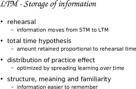
LTM - Storage of information rehearsal – information moves from STM to LTM total time hypothesis – amount retained proportional to rehearsal time distribution of practice effect – optimized by spreading learning over time structure, meaning and familiarity – information easier to remember
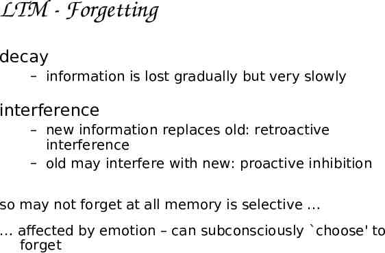
LTM - Forgetting decay – information is lost gradually but very slowly interference – new information replaces old: retroactive interference – old may interfere with new: proactive inhibition so may not forget at all memory is selective affected by emotion – can subconsciously choose' to forget
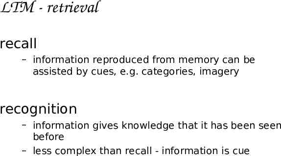
LTM - retrieval recall – information reproduced from memory can be assisted by cues, e.g. categories, imagery recognition – information gives knowledge that it has been seen before – less complex than recall - information is cue
Thinking Reasoning deduction, induction, abduction Problem solving
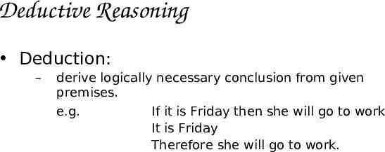
Deductive Reasoning Deduction: – derive logically necessary conclusion from given premises. e.g. If it is Friday then she will go to work It is Friday Therefore she will go to work.
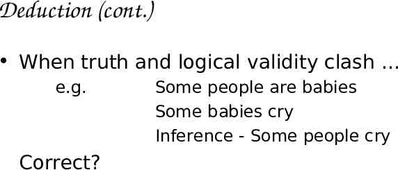
Deduction (cont.) When truth and logical validity clash e.g. Correct? Some people are babies Some babies cry Inference - Some people cry
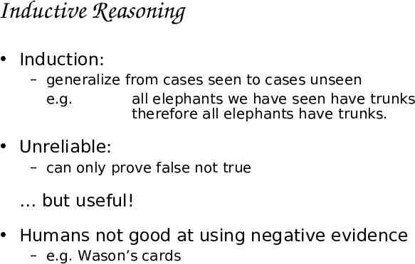
Inductive Reasoning Induction: – generalize from cases seen to cases unseen e.g. all elephants we have seen have trunks therefore all elephants have trunks. Unreliable: – can only prove false not true but useful! Humans not good at using negative evidence – e.g. Wason’s cards
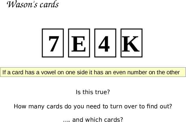
Wason's cards 7 E 4 K If a card has a vowel on one side it has an even number on the other Is this true? How many cards do you need to turn over to find out? . and which cards?
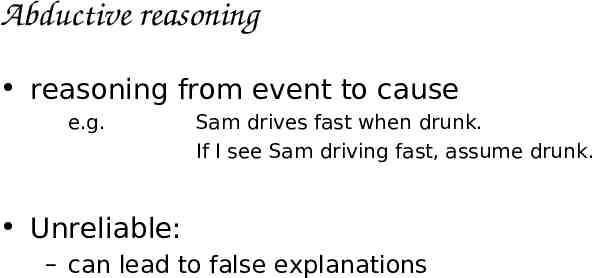
Abductive reasoning reasoning from event to cause e.g. Sam drives fast when drunk. If I see Sam driving fast, assume drunk. Unreliable: – can lead to false explanations
Problem solving Process of finding solution to unfamiliar task using knowledge. Several theories. Gestalt – problem solving both productive and reproductive – productive draws on insight and restructuring of problem – attractive but not enough evidence to explain insight' etc. – move away from behaviourism and led towards information processing theories
Problem solving (cont.) Problem space theory – problem space comprises problem states – problem solving involves generating states using legal operators – heuristics may be employed to select operators e.g. means-ends analysis – operates within human information processing system e.g. STM limits etc. – largely applied to problem solving in well-defined areas e.g. puzzles rather than knowledge intensive areas
Problem solving (cont.) Analogy – analogical mapping: novel problems in new domain? use knowledge of similar problem from similar domain – analogical mapping difficult if domains are semantically different Skill acquisition – skilled activity characterized by chunking lot of information is chunked to optimize STM – conceptual rather than superficial grouping of problems – information is structured more effectively
Errors and mental models Types of error slips – – – right intention, but failed to do it right causes: poor physical skill,inattention etc. change to aspect of skilled behaviour can cause slip mistakes – – wrong intention cause: incorrect understanding humans create mental models to explain behaviour. if wrong (different from actual system) errors can occur
Mental models Users develop an understanding of a system through learning & using it Knowledge is often described as a mental model – How to use the system (what to do next) – What to do with unfamiliar systems or unexpected situations (how the system works) People make inferences using mental models of how to carry out tasks
Mental models Craik (1943) described mental models as internal constructions of some aspect of the external world enabling predictions to be made Involves unconscious and conscious processes, where images and analogies are activated Deep versus shallow models (e.g. how to drive a car and how it works)
Everyday reasoning & mental models (a) You arrive home on a cold winter’s night to a cold house. How do you get the house to warm up as quickly as possible? Set the thermostat to be at its highest or to the desired temperature? (b) You arrive home starving hungry. You look in the fridge and find all that is left is an uncooked pizza. You have an electric oven. Do you warm it up to 375 degrees first and then put it in (as specified by the instructions) or turn the oven up higher to try to warm it up quicker?
Heating up a room or oven that is thermostatcontrolled Many people have erroneous mental models (Kempton, 1996) Why? – General valve theory, where ‘more is more’ principle is generalised to different settings (e.g. gas pedal, gas cooker, tap, radio volume) – Thermostats based on model of on-off switch model
Heating up a room or oven that is thermostatcontrolled Same is often true for understanding how interactive devices and computers work: – Poor, often incomplete, easily confusable, based on inappropriate analogies and superstition (Norman, 1983) – e.g. frozen cursor/screen - most people will bash all manner of keys
External cognition Concerned with explaining how we interact with external representations (e.g. maps, notes, diagrams) What are the cognitive benefits and what processes involved How they extend our cognition What computer-based representations can we develop to help even more?
Externalizing to reduce memory load Diaries, reminders,calendars, notes, shopping lists, to-do lists - written to remind us of what to do Post-its, piles, marked emails - where placed indicates priority of what to do External representations: – Remind us something – Remind us – Remind us date) that we need to do something (e.g. to buy for mother’s day) of what to do (e.g. buy a card) when to do something (e.g. send a card by a certain
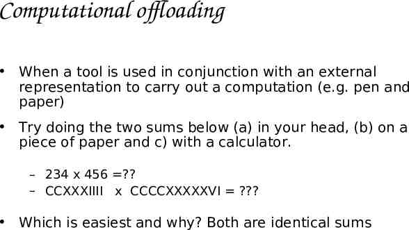
Computational offloading When a tool is used in conjunction with an external representation to carry out a computation (e.g. pen and paper) Try doing the two sums below (a) in your head, (b) on a piece of paper and c) with a calculator. – 234 x 456 ? – CCXXXIIII x CCCCXXXXXVI ? Which is easiest and why? Both are identical sums
Annotation and cognitive tracing Annotation involves modifying existing representations through making marks – e.g. crossing off, ticking, underlining Cognitive tracing involves externally manipulating items into different orders or structures – e.g. playing scrabble, playing cards
Emotion Various theories of how emotion works – James-Lange: emotion is our interpretation of a physiological response to a stimuli – Cannon: emotion is a psychological response to a stimuli – Schacter-Singer: emotion is the result of our evaluation of our physiological responses, in the light of the whole situation we are in Emotion clearly involves both cognitive and physical responses to stimuli
Emotion (cont.) The biological response to physical stimuli is called affect Affect influences how we respond to situations – positive creative problem solving – negative narrow thinking “Negative affect can make it harder to do even easy tasks; positive affect can make it easier to do difficult tasks” (Donald Norman)
Emotion (cont.) Implications for interface design – stress will increase the difficulty of problem solving – relaxed users will be more forgiving of shortcomings in design – aesthetically pleasing and rewarding interfaces will increase positive affect
Individual differences long term – gender, physical and intellectual abilities short term – effect of stress or fatigue changing – age Ask yourself: will design decision exclude section of user population?
Psychology and the Design of Interactive System Some direct applications – e.g. detail blue acuity is poor blue should not be used for important However, correct application generally requires understanding of context in psychology, and an understanding of particular experimental conditions
Involving users in the design At the very least, talk to users – It’s surprising how many designers don’t! Contextual Inquiries – Interview users in their usage place (e.g., office), during their normal routine (e.g., while working) – Used to discover user’s culture, requirements, expectations, etc.
Involving users in the design Create prototypes – It’s hard to comment on something that doesn’t yet exist – Users are good at giving feedback for something that is even partially built
Assignment #2: Reading assignment Simulated Augmented Reality Windshield Display as a Cognitive Mapping Aid for Elder Driver Navigation by Kim and Dey, CHI 2009 Quiz from the reading assignment at the end of the first hour of the class on November 4. No class on October 28 due to 29 Ekim Cumhuriyet Bayrami. Reading assignments are available at the Schedule section of the course home page.


