Design Elements
18 Slides895.77 KB
Design Elements
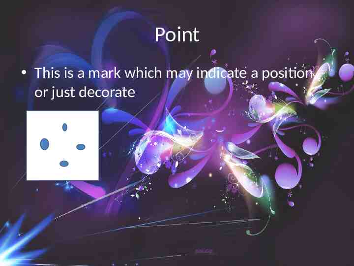
Point This is a mark which may indicate a position, or just decorate
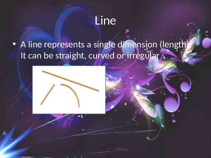
Line A line represents a single dimension (length). It can be straight, curved or irregular
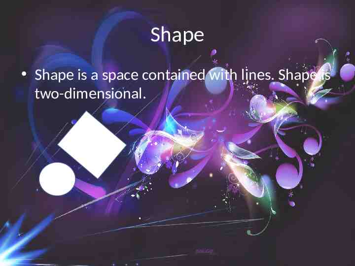
Shape Shape is a space contained with lines. Shape is two-dimensional.
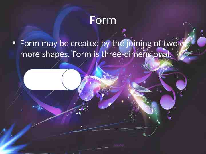
Form Form may be created by the joining of two or more shapes. Form is three-dimensional.
Tone Tone may be used to describe form in terms of shadow and highlights.
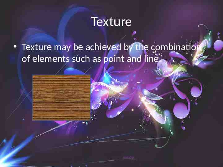
Texture Texture may be achieved by the combination of elements such as point and line.
Colour Colour should be considered in conjunction with the other elements. If used well it can add interest and excitement to a piece of visual communication.
Letterform Letterform can be abstract physical representation of the spoken word H h h h.
Design Principles
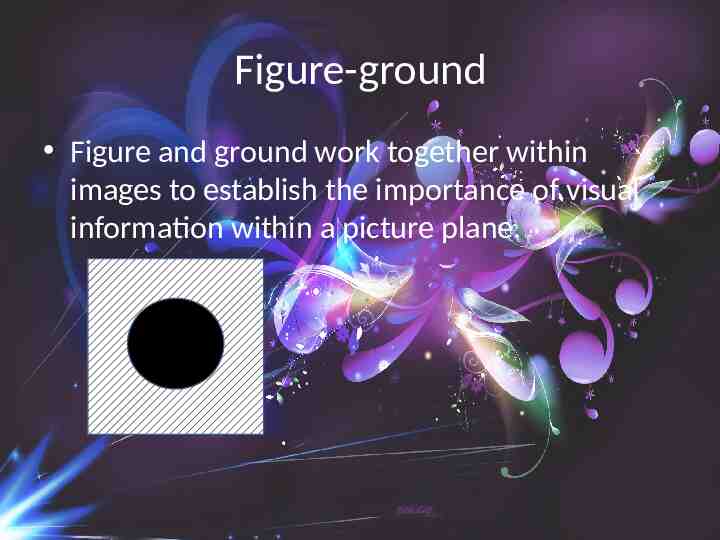
Figure-ground Figure and ground work together within images to establish the importance of visual information within a picture plane.
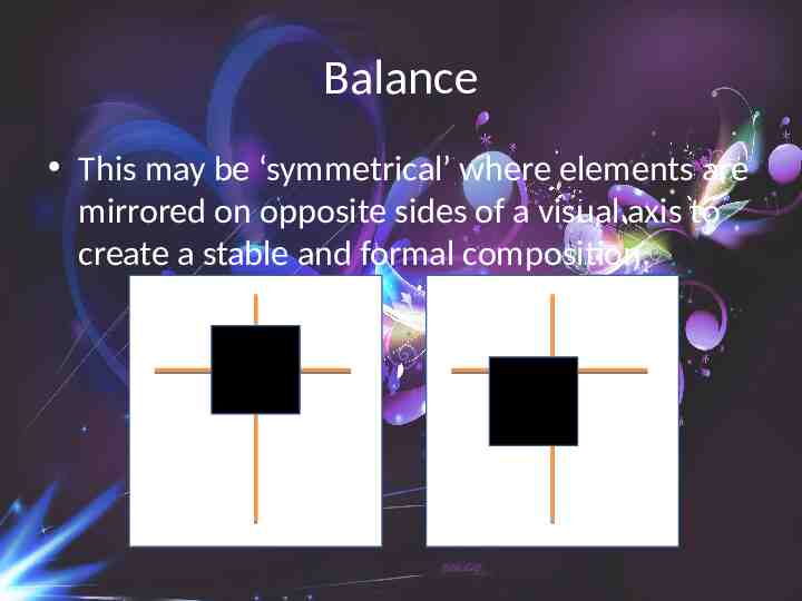
Balance This may be ‘symmetrical’ where elements are mirrored on opposite sides of a visual axis to create a stable and formal composition.
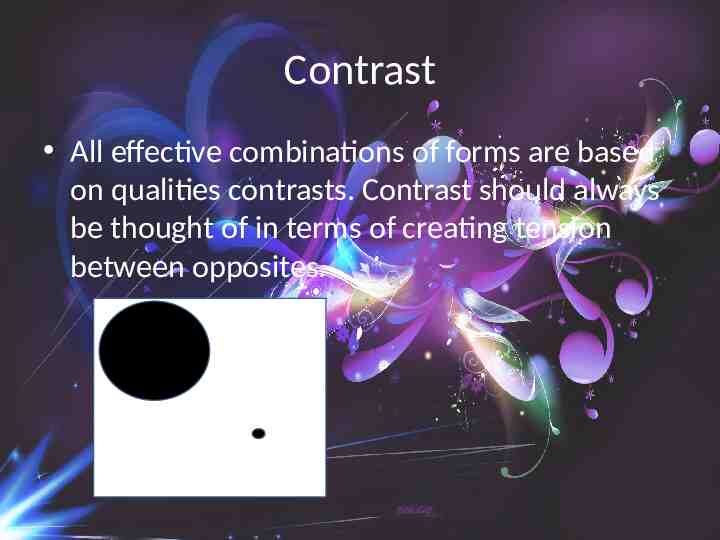
Contrast All effective combinations of forms are based on qualities contrasts. Contrast should always be thought of in terms of creating tension between opposites.
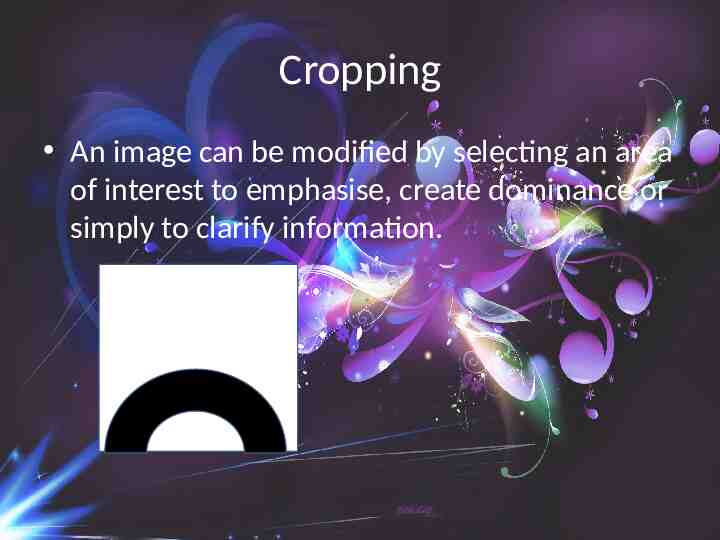
Cropping An image can be modified by selecting an area of interest to emphasise, create dominance or simply to clarify information.
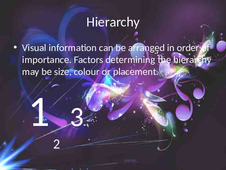
Hierarchy Visual information can be arranged in order of importance. Factors determining the hierarchy may be size, colour or placement. 1 3 2
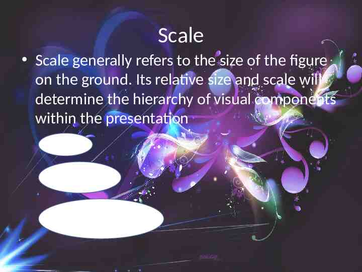
Scale Scale generally refers to the size of the figure on the ground. Its relative size and scale will determine the hierarchy of visual components within the presentation
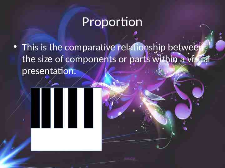
Proportion This is the comparative relationship between the size of components or parts within a visual presentation.
Pattern Pattern is the repetition or alternation of one or more components to create visual art. Any visual element can be used to create a pattern

