Creating the customer experience: web interfaces and usability
26 Slides139.50 KB
Creating the customer experience: web interfaces and usability MARK 430 Week 5
4 steps to successful marketing strategy Understanding customer needs and online behaviour (market research, data mining, web analytics) (Weeks 1 - 4) Formulate a strategy to fill needs (segmentation, targeting, positioning) (Weeks 4 - 5) Implement effectively and efficiently (web usability, stickiness, advertising, search engine optimization, email marketing, pricing, distribution, product development) (Weeks 512) Build trusting relationships with customers (Week 13)
Customer Experience and the web interface During this class we will: Introduce and define the concept of customer experience Examine the three stages of the customer-experience hierarchy Understand the seven elements of customer interface — the “7Cs” Explore the significance of the user interface
Some terminology Trust cues related to privacy and security related to the whole look and feel and functionality of the site Stickiness getting visitors to come back getting them to stay longer Usability user-focused design
Customer experience Once a firm has decided on the positioning of its product offering, it must clearly articulate the customer experience that it wants to create. Customer experience “refers to a target customer’s perception and interpretation of all the stimuli encountered while interacting with a firm” (Mohammed et al pg. 130) In an offline example - the customer experience in a Starbucks is not limited to the taste of the coffee Online, the customer experience includes the entire range of a visitor’s perception of a website - from ease of use to the emotional reactions to a site’s content It is the user’s interpretation of his or her complete encounter with the site
Elements of the customer experience Functional perceptions Sensory perceptions Sight Sound Touch Smell Taste Cognitive and emotional elements
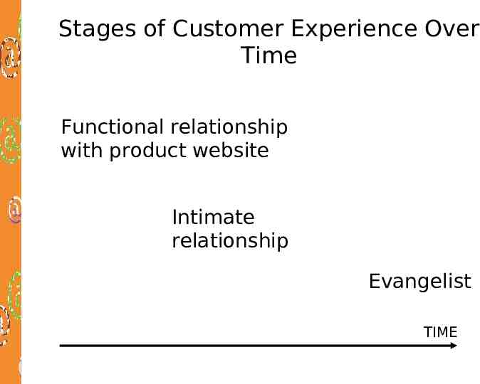
Stages of Customer Experience Over Time Functional relationship with product website Intimate relationship Evangelist TIME
Stages of Customer Experience - turn your customers into evangelists for your product This Is What the Customer If a Firm Gets This Right Stage One: Functionality Stage Two: Intimacy Stage Three: Evangelism Usability and ease of navigation Speed Reliability Security Media accessibility Customization (tailoring and personalization) Communication Consistency Trustworthiness Exceptional value Shift from consumption activity to recreational activity Taking the message to the market Active community membership The company cares about my opinions Defender of the experience Experiences Site is easy to use Quick downloads Intuitive navigation Site reliability Personalization Increasing trust Repeated experiences of exceptional value A sense of “being in the know” Consistent experiences Significant benefits relative to other offerings Desire to take messages to the market Community benefits
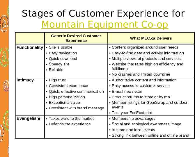
Stages of Customer Experience for Mountain Equipment Co-op Generic Desired Customer Experience Functionality Intimacy Evangelism Site is usable Easy navigation Quick download Speedy site Reliable High trust Consistent experience Quick, effective communication High personalization Exceptional value Consistent with brand message Takes word to the market Defends the experience What MEC.ca Delivers Content organized around user needs Easy-to-find gear and activity information Multiple views of products and services Website that rates high on efficiency and fulfillment No crashes and limited downtime Authoritative content and information Easy access to customer service E-mail newsletter Product returns to store or by mail Member listings for GearSwap and outdoor events Test your EcoFootprint Membership advantages Social and ecological awareness image In-store and local events Strong link between online and offline brand
Some things that really damage Customer Experience on a commerce site Badly implemented search Not telling people an item is out of stock until late in the process Shipping cost not given until late in the process Asking for personal information too early in the process No contact information Can’t print properly
Crafting the customer interface We are moving now to focus on customer / website interface issues - one element of the customer experience, but a very important one
The importance of the web interface Internet technology has caused a shift in the way in which firms interact with their customers Face-to-face encounters common in the retail environment have been replaced with screento-face interactions. Interfaces include desktop PCs, laptops/notebooks, web kiosks, handhelds such as PDAs and cellphones We will focus mostly on web interfaces
The 7Cs (design elements) of the Customer Interface 1. 2. 3. 4. 5. 6. 7. Site’s layout and design: functional look and feel (the “how” of the site) Text, pictures, sound and video that webpages contain (the “what” of the site) The ways sites build relationships between users (message boards, reviews) Site’s ability to self-tailor to different users or to allow users to personalize the site The ways sites enable site-to-user communication or two-way communication Degree site is linked to other sites Site’s capabilities to enable commercial transactions (shopping cards. payment options, order confirmation etc) Context Content Community Customization Communication Connection Commerce
Context (look and feel): the “How” of the site 2 main dimensions: Function and Aesthetics Function - site layout and functionality Section breakdown - the way the site is organized into subcategories make them clear, and customer focused Linking structures - navigation where am I? how do I get back to where I came from? (breadcrumbs) Navigation tools - search functionality and methods, browse capability, site index/map Use terminology the customer can understand Make sure your search tool works - configure it Aesthetics - visual characteristics such as colours, graphics, fonts etc
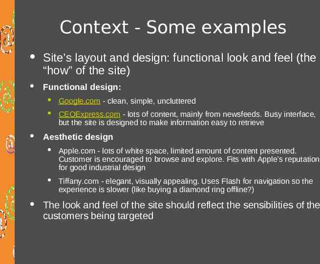
Context - Some examples Site’s layout and design: functional look and feel (the “how” of the site) Functional design: Google.com - clean, simple, uncluttered CEOExpress.com - lots of content, mainly from newsfeeds. Busy interface, but the site is designed to make information easy to retrieve Aesthetic design Apple.com - lots of white space, limited amount of content presented. Customer is encouraged to browse and explore. Fits with Apple’s reputation for good industrial design Tiffany.com - elegant, visually appealing. Uses Flash for navigation so the experience is slower (like buying a diamond ring offline?) The look and feel of the site should reflect the sensibilities of the customers being targeted
Content: the “What” of the site Text, pictures, sound and video both the type of content, and the media with which it is delivered The offering mix: products, information, services etc The appeal mix: promotional and communications messages The media mix: the multimedia elements included on the site Be careful with adding too many multimedia elements that require plug-ins unless you have good market research that shows that your users expect it. Content type: time sensitive information versus “evergreen” information Freshness keeps bringing customers back Archives provide a useful service to users Watch out for “What’s New” sections
Community Community: the way sites build relationships between users. Strong community encourages people to return to the website again and again Community can create attractive content (for free!) Web communities can make the user feel that they are valued by the firm Community can satisfy needs not otherwise able to be satisfied individually (eg. finding people) Common tools are message boards, customer reviews, chat with special guests, corporate blogs, members areas Other examples: Lands’ End “Shop with a Friend”,
Customization Customization is the site’s ability to self-tailor to different users The way customization can be achieved is divided roughly into 2 types (although many sites use both) Personalization - preferences actively selected by the user Tailoring by site - automatically generated customization based on a user’s previous behaviour, and the actions of other similar users
Personalization Personalization is usually used to refer to customization of a site by the user him or herself. Promotes stickiness and customer loyalty Once a user has selected preferences, they must be saved and can then be accessed by use of registration/log in. Examples of personalization: E-mail accounts or storage space Content and layout configurations - mytelus.com Software agents - can be configured to notify a user when an item is in stock, or to act as an alert service Cookies are often used in tandem with personalization, but they can identify only the machine on which the cookie is stored, not the individual person. Hence the need for log-in.
Tailoring by site The second type involves automatically generated customization based on a user’s previous behaviour, and the actions of other similar users Interface software dynamically publishes different versions of the site in order to better address users’ interests, habits, and needs. The technologies to achieve this include cookies, and recommendation engines that use collaborative filtering. This is all completely automated, but can be improved by using active user input.
Personalization/customization using a combination of tools Amazon.com provides a very good example of this combination of methods to customize the user experience using collaborative filtering and a recommendation engine Lands’ End - My Model (allows you to configure a model to your body type and appearance and try on clothes) and My Personal Shopper (uses “Conjoint analysis” presents alternatives for selection)
Communication Communication refers to a firm’s dialogue with its customers Dialogue can be one-way (broadcast) or two-way (interactive) Broadcast communication Mass mailings (opt in only!) E-mail newsletter Content update notifications Interactive e-commerce dialog using email to exchange information re orders etc Customer service - email or live chat User input - content, reviews, feedback etc
Connection: how does a firm connect to other businesses? Links to other sites Outsourced content - eg. news feeds, stock quotes, weather etc Affiliated sites - complementary products/services etc
Dimensions of Commerce Commerce refers to those aspects of the user interface that support the various aspects of trading transactions Registration Shopping cart Security Credit card approval One-Click Shopping (Amazon patented feature) Orders through affiliate programs Configuration and comparison mechanisms Order tracking Delivery options
Fit and Reinforcement of 7Cs to create synergy. How well do they work together? Business Business Model Model and and Marketing Marketing Strategy Strategy Fit: Does each of the 7Cs individually support the Business Model and Strategy? Context Context Content Content Community Community Customization Customization Communication Communication Reinforcement depends on consistency between the 7Cs Based on Mohammed 2003 Connection Connection Commerce Commerce
In the lab next week We will be applying the 7Cs of the customer interface to websites to help us to analyze what works in a web interface, and what needs fixing
